Look at Matisse's blue nudes and see what you can learn from them. What makes them so powerful? Is it the simplicity, the composition, the cut out quality? Find other artists work who work in this way and compare them to Matisse and to what you are doing.
I was fortunate enough to go to the exhibition of Matisse cut outs at Tate Modern in 2014. Below are photographs of some of the sketchbook pages on which I made notes about this exhibition.
Matisse started to work with cutouts in the 1940s when health problems started to restrict his ability to paint. Initially he used them as a tool for planning paintings - he would cut out the elements of a still life enabling him to move each element around and try out different compositions before committing to painting. After the publishing of his artist's book, "Jazz", Matisse began to realise that the impact of the cutouts was somewhat reduced by reprinting them. He began to view the cutouts as an art form in their own right. (1)


The blue nudes themselves carry particular impact among Matisse's cutouts. I think this stems partly from their deceptive simplicity and partly from the composition.
Matisse has reduced the body to elemental shapes with no extraneous details included which might detract from the sharp contrast between the blue of the figure and the off white of the background. However, the artist has also skilfully used the white of the background across the body too - this is not a simple silhouette (like the one I produced) but a more complex assemblage of shapes which when put together still 'read' quite clearly as a female nude. Matisse has effectively drawn lines using the negative space, the white of the background.
The composition is very interesting - there are lots of diagonals which make for a feeling of dynamism yet the eye is also drawn round in a circular motion to stay within the frame. In the example shown in the sketchbook above, the foot brings your eye into the frame at the lower left hand corner and then the eye is drawn up the torso towards the head. From here the arms cause the eye to travel back down in a circle to the other foot and then back up the shin curving around in the front. For such an apparently simple piece of work, the composition is actually quite complex and has been deftly manipulated for maximum impact.
Find other artists work who work in this way and compare them to Matisse and to what you are doing.
'Artists who work in this way' could be open to interpretation. It could mean artists who work with paper cutting. Collage artists. Artists who use simplified shapes/ abstractions/bold colours. Artists who stick things on walls. Artists who portray female nudes. I made a mind map of examples of all of these and put some examples of work in my sketchbook. In the text, however I will concentrate in paper cut and collage as I am choosing to mainly interpret 'work in this way' as applying to cutting shapes out of paper.
Artists who use paper cutting:
I am going to confine myself to modern or contemporary artists here rather than try and do a an exhaustive history of paper cutting but I will just mention that portraits cut from black card as a silhouette became popular in the mid 18th century and there are many forms of traditional paper cutting throughout the world. The silhouette has also been popular for use in book illustrations (2).
1. Kara Walker
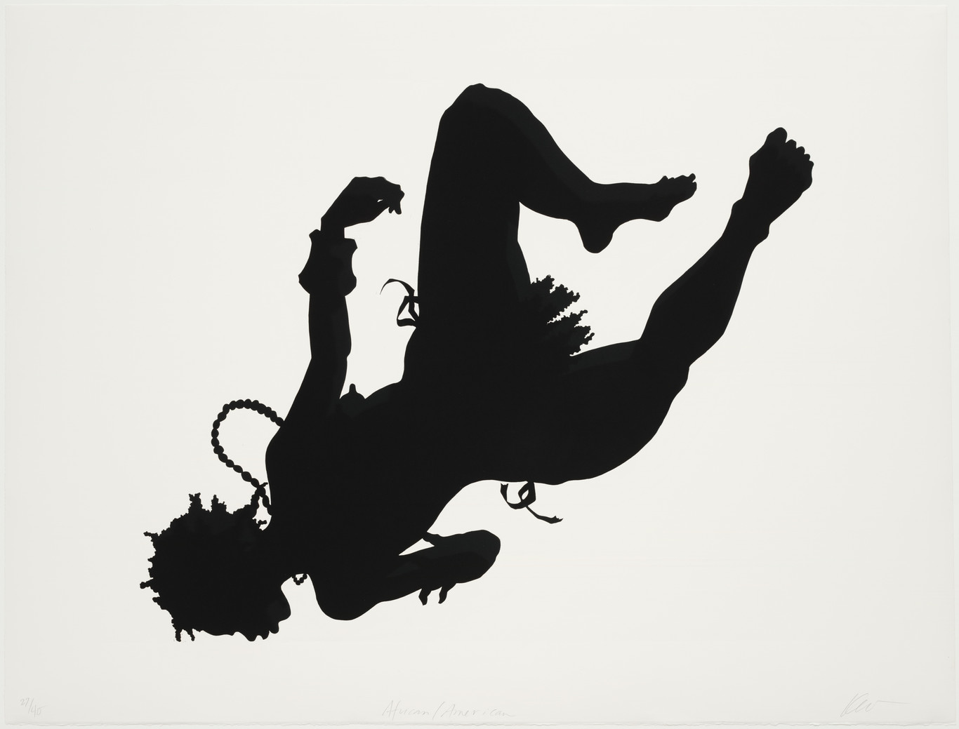
Is an artist who hijacked the silhouette as an art form and contrasted the traditional beauty of intricate illustrative cutouts (on a very large scale, black on white walls) with controversial subject matter which draws attention to racial inequality. (3)(4)(5)
The form of her work comes from the genteel tradition of the portrait silhouette so her works have a formal beauty to them. However, the subject matter subverts this art form. The stereotypical physical features of the characters depicted in her panoramas make their racial identity as either black or white very clear. The African-American characters have fat lips and flat profiles. Walker's stereotypical images are based on depictions of slaves in textbooks of the antebellum (pre civil-war) era. (1)
Her imagery is often violent or overtly sexual so there's a tension between the playful illustrative storytelling of the technique she uses and the subject matter which creates an ambivalence in the viewer - a powerful gut reaction. What is the appropriate response? - A nervous giggle? Disgust? Reverence?
An example would be her installation "Gone: An Historical Romance of the Civil War as it Occurred b'tween the Dusky Thighs of One Young Negress and Her Heart. 1994"
This is a mural-sized silhouette instillation and MoMA in New York.
This is a mural-sized silhouette instillation and MoMA in New York.
The title comes partly from the novel (and later epic technicolour film) 'Gone with the Wind.' by Margaret Mitchell(6)(7).The book is a historical romance set in the Deep South leading up to the civil war. Some of the characters are African slave stereotypes such as the wise old 'mammy' and the pickaninny.
The negress in the title is herself as if she is putting herself into a history painting, but it is also sourced from Thomas Dixon Jr's 'The Clamsman' , a 19th century racist epic in which a character described as a 'tawny negress' is manipulating a hapless statesman. (7).
Later installations used overhead projectors to project colour onto the walls (Perhaps a reference to 'glorious technicolour'?) - her images are quite cinematic in composition and scale. The projectors are set up so that the shadow of the viewer becomes one with the work - the viewer becomes a participant in the action whether willingly or not. (4)
This theme is continued in a series of faux slave testimonials in which Walker writes, 'worse than you bein' my nemesis, my servant or a turncoat, is the possibility of yer bein' a innocent' (4)
Walker herself is an African-American and her engagement with race, gender and identity issues is partly informed by the culture shock she experienced when moving from California to Georgia as a teeneger where she encoutered over racism (3). She is also influenced by the confrontational aspect of pop art - in particular the work of Andy Warhol.
Walker does use printmaking in her practice. She has made large scale lino cuts such as African American (link) 1998. She has also used etching and aquatint as well as producing a series of lithographs to illustrate 'Porgy and Bess'.(6)
Kara Walker acheived widespread critical acclaim from the early 1990s onwards. Her work, however was not universally well received. Betye Saar (link) wrote that her work was 'a revolting and negative form of betrayal to the slaves and basically for the amusement and investment of the white art establishment'. Protesters questioned the negative sterotypical images used as 'Pandering - a minstrel performace, dishing out unmediated stereotypes to whites'.(3)
Comparing Walker's work with the Mattise cut outs:
Execution is similar - dark on light bold large scale paper cuts so very similar
Style is largely similar- flat dark shapes against a light background but these are illustrative silhouettes whereas Matisses are more abstracted and the body is fragmented with white being used as lines within the forms.
Subject Matter - both are figurative and both depict women's bodies. Matisse's nudes are from the long tradition of women's bodies as object of posession and for admiration. Walker's women's bodies are also taking about possession and objectivication but as political commentary rather than presented as onjects of beauty and admiration alone.
2. Rob Ryan
I first encountered the work of Rob Ryan through seeing and exhibition at the Yorkshire Sculpture Park in 2015 Click Here to link to an article in the Guardian about the exhibition. (10)
Ryan was born in Cyprus but lives and works in London. He is best known for his paper cuts but he does work in other media including screen print and watercolours. His paper cuts are very intricate, often containing text. I find the amount of detail in the work astounding, however, I also find they are rather sentimental which is not to my personal taste. His work has gained popularity with the public through commercial collaborations - the licensing of his images to appear on crockery, tea-towels and the like.
Comparing Ryan's work with the Matisse cut outs:
Execution - both exploit contrast with dark paper against a white background but Matisse uses bold shapes and Ryan's work is more intricate.
Style- the similarity really ends at the technique and placement of dark papers against a light background. Ryan's work is much 'busier' and the text is a major component of the work - it seems more illustrative rather than Matisse's abstracted pieces.
Subject Matter - Ryan's work does often contain human figures. They are simplified but in a more cartoonish than abstracted fashion. The figures illustrate the sentiments expressed by the text - to me it seems that the text is the main focus of the work.
3. Rogan Brown
What first drew me (being from a science background) to Brown's work is the clear link between science and art that he conveys with his intricate sculptures made from layer upon layer of cut paper. I love the organic forms he uses. Subjects include diverse organic elements from microscopic bacteria to bacterial and fungal cultures displayed in and overflowing petri-dishes, to macroscopic chestnut kernels. His larger scale works are cut by hand but he will also use laser cutting for the more delicate forms.
His works are made entirely from white paper allowing him to exploit the light and shade created by the lit forms to their maximum potential.
Comparing Brown's work with the Matisse Cut Outs:
Execution - Matisse cut his works freehand from paper painted with gouache using scissors. Brown uses entirely white paper and cuts either using a scalpel or a laser cutter hence the precision of his cutting is enhanced - to create such intricate sculptures there must surely be lots of advanced planning - a single work can take him several months to complete.
Style - Brown's work is three dimensional (albeit constructed from layers of flat shapes), sculptural and monochrome whereas Matisse uses bold colours and flat shapes.
Subject - Both use organic forms but there are no human figures in Brown's work - instead he sometimes uses parts of the body or the microbes which reside within it.
4. Mia Pearlman
Pearlman creates large scale installations using layer upon layer of cut paper and incorporating aspects of the space in which the work is displayed (such as a light source, window or the sky itself). Her work is once again inspired by organic forms. She often starts her work by painting freehand on large sheets of paper with India ink and then cutting out the negative shapes. Click here to link to the artist being interviewed about her process (13). The process as well as the shapes is quite organic and spontaneous - the artist reacting to the shapes and making decisions as she works rather than carefully planning each cut.
Comparing Pearlman's work to the Matisse Cut Outs:
Execution - Although Pearlman does pre-draw shapes on the paper and uses a craft knife rather than scissors, there is a similarity in terms of the spontaneity with which the work is executed.
Style - Pearlman's work is monochrome, cultural and intricate compared to the bold colours and flat shapes of Matisse's blue nudes
Subject Matter - Both are inspired by organic forms but Pearlman's work is completely abstract whereas Matisse's nudes are abstracted but still recognisable as figures.
Comparing the above paper cut work to what I am doing with the masked monoprints it seems obvious to me that the bold shapes of Matisse and Walker would be more suited to this technique than very intricate paper cuts especially when pulling prints by hand - too much detail is likely to be lost in the printing process - although I's like to give it a try!
Artists Who Use Collage:
(1) Cubist Collage - Picasso and Braque
The cubists are credited with bringing collage into modern fine art. They began to experiment with 'papers collé'. Still Life with Chair Caning (link) (15) is credited as being the first modern art collage in 1912 - this is an oil painting onto which has been glued printed oilcloth. (14). This led to a radical new direction for the cubists. A departure from complex fractured planes to simpler bolder shapes and papers of various types and textures overlaid on top of each other.
In addition to the change of aesthetic there was also a departure from 'iconic' representation in that looking like the object represented made way for the semiotic realm of the 'symbolic' (arbitrary signs and symbols which while not physically resembling the object represented are taken to mean the object they represent - this happens in language - for example the word 'apple' in no way resembles the shape, colour, form, smell or taste of the fruit but is understood to represent it).(14) An example of this occurs in the collage Violin 1912 (link) (16). The two pieces of paper used are cut from the same piece of newspaper and are essentially mirror images of each other. One is used within the charcoal drawing of the violin to represent the wood grain whereas the positioning of the other one means that it signifies the background - two almost identical pieces of paper, one representing the opaque wood grained surface of the instrument and the other representing the translucency of the background (14)
The other level of complexity that is introduced by working in collage is the choice of the paper that is glued as this itself can also be interpreted as having meaning - were the pieces of newspaper selected deliberately for the writing they contained as part of the symbolism of the collage as a whole?
Comparing the cubist collages to Matisse's cut outs:
Execution - Both employ paper shapes cut with scissors and glued in place. Matisse uses paper coloured with gouache whereas the cubists employ found papers. Matisse's blue nudes use one layer of paper cut outs with the white of the paper forming and important part of the designs. The cubist collages sometimes use several layers of paper on top of each other to contract their designs.
Style - Both employ abstraction - Matisse's nudes are however still clearly legible as representing the human form. Picasso and Braque started to move away from iconography towards symbolism but in many of the collages the still lives are still 'legible' as the forms they represent.
Subject Matter - The cubist collages seem to be mainly still lives rather than human figures.
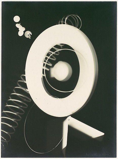
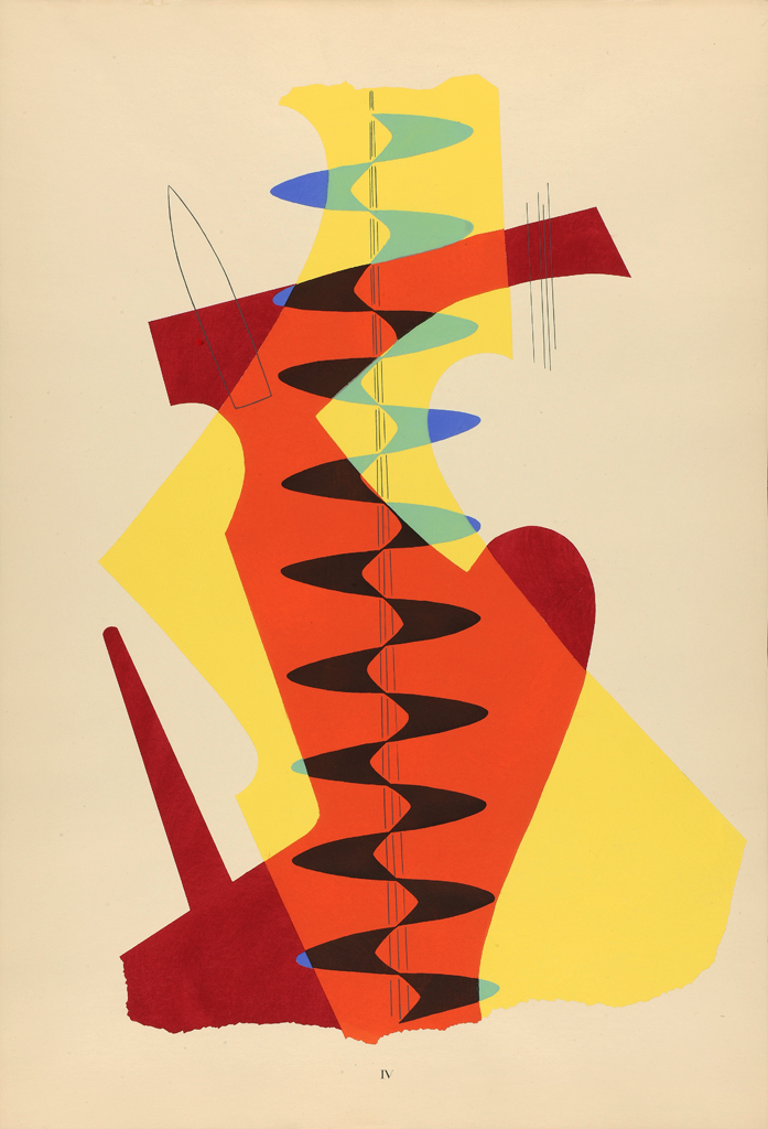
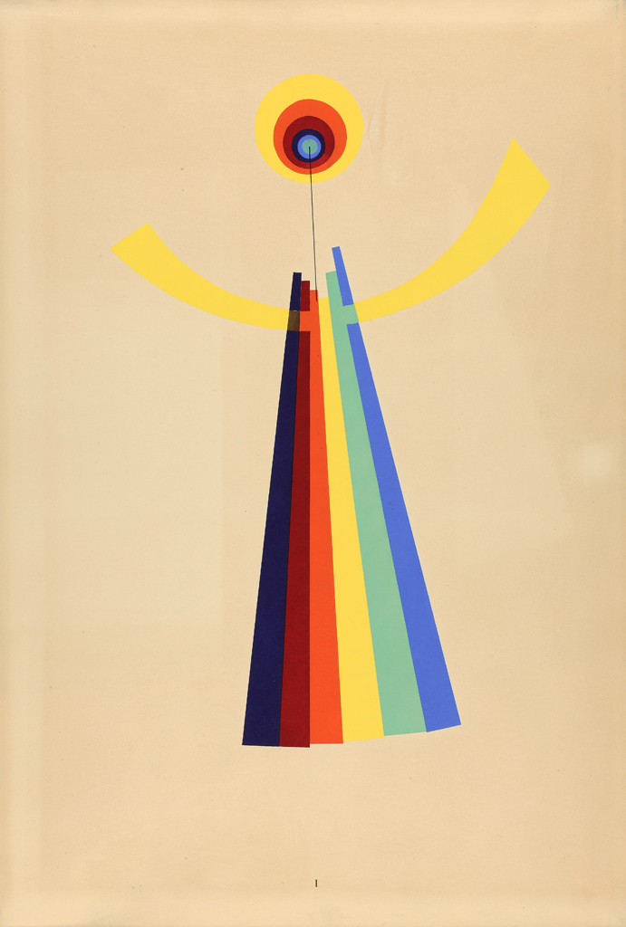
(2) Man Ray
I stumbled across Man Ray's collage's quite by accident - I was looking at his Rayographs (link) (17) which are images made without a camera by placing objects directly onto photosensitive paper and exposing them to light. (18). I was struck by the bold flat shapes produced by this technique which I thought could be utilised in the stencil/masked monoprinting. During my internet research on these I came across his collage work (link) (19)
The bold shapes and bright colours used here would be eminently suitable for adaptation into masked monoprints - in fact the original collages were destroyed and reproduced as stencil prints (20).
Man Ray mounted these collages on poles so that the viewer could spin them.
Comparing the work to Matisse's cut outs:
Execution: - Both employ flat bold shapes in bright colours - the blue nudes only employ one colour whereas Man Ray's collages are multicoloured and there is interplay between the colours adjacent to or overlaid one on top of the other.
Style: - Both employ abstraction. Matisse uses almost entirely organic forms whereas there are more geometric shapes in Man Ray's work.
Subject: - Despite the use of geometric shapes, some of man Ray's collages are in fact anthropomorphic Here is an example (link) (21)
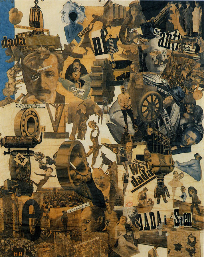
(3) Hannah Höch
Was one of the major artists within the dada movement after world war 1 (despite their efforts to edge her out). She was a pioneer of photomontage collage - this may have partially stemmed from the time she spent working in publishing. (22)
Her best known work is Cut With the Kitchen Knife Dada Through the Last Weimar Beer-Belly Cultural Epoch of Germany (23) (link) which was displayed at the first Dada Fair in 1920. It is a political and social commentary and also tackles gender issues. The Weimar government and the army are placed in opposite corner to the artists of dada and communist radicals. In the lower right corner is a map showing all the countries in Europe in which women were then allowed to vote.
Höch used images of modern athletic women superimposed on sentimental 19th century pictures of women. She frequently used disembodied legs to illustrate energy in women. She used images from an ethnographic museum and produced grotesque mixtures of heads , masks , statues and other body parts against brightly coloured backgrounds. Click here for an examples of her work. This reflected her interest in different cultural standards of beauty. By fragmenting the body she alienates the parts and puts them back together in a different way intended to make the viewer think.
She was listed as a 'degenerate artist' by the Nazis and she hid out in the outskirts of Berlin until the end of WW2
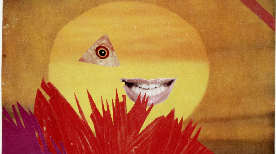
Her later works became more decorative in abstraction because she took her source material from colourful adverts rather than newspapers. However she still used some of the same motifs - an example is fragmented female body parts - in Little Sun 1969 (link) (24) she uses a cut out of Marylin Monroe's smile alongside a fish's eye.
Comparing Höch's work to matisse's cut outs:
Execution: - Both use shapes cut from pieces of paper but Mattisse uses shapes of flat colour whereas Höch uses photographs (ready made images) and photomontage.
Style: - Both employ abstraction but in different ways - Matisse uses flat shapes to out together to convey a whole figure. Höch on the other hand uses recognisable structures such as body parts but alienates them by fragmenting the body and constructing alternate images from combined parts of different images.
Subject Matter: - Höch does depict the female body in an abstract form but whereas Matisse's abstract female figures celebrate a sort of classic idea of female beauty, Höch creates grotesque images which challenge the viewer to reconsider ideas of conventional beauty.
I have looked at many other artists during this research point but do not intend to go into detail about any of the others for fear of this research point becoming too long-winded. I looked at the flat nature of the pop art screen printing by Andy Warhol as well as work by Patrick Caulfield. Click here to link to a previous research point about Patrick Caulfield and Here to visit my write up of a list to an exhibition of Caulfield's work. I looked at these artists because I saw a similarity between the cut outs and the flat simplified shapes in their work.
From here I also saw links from there artists to urban and street artists such as Banksy and our our Neapolitan street artists Cyop e Kaf. I was. drawn to these artists because of their use of stencils and flat shapes in bold colours.
I also just want to mention the subject matter of the female figure. Matisse's blue nudes are part of a longstanding tradition of portrayal of the nude female figure in art. These seem to be an end result of the development of his work through primitivism and progressive abstraction alongside the work of Picasso and Gaugin. Henry Moore and Barbara Hepworth are examples of artists who have used extensively abstracted female figure forms. I have previously done some research about the objectification of the female body Click here to review the resulting essay.
Höch used images of modern athletic women superimposed on sentimental 19th century pictures of women. She frequently used disembodied legs to illustrate energy in women. She used images from an ethnographic museum and produced grotesque mixtures of heads , masks , statues and other body parts against brightly coloured backgrounds. Click here for an examples of her work. This reflected her interest in different cultural standards of beauty. By fragmenting the body she alienates the parts and puts them back together in a different way intended to make the viewer think.
She was listed as a 'degenerate artist' by the Nazis and she hid out in the outskirts of Berlin until the end of WW2
Her later works became more decorative in abstraction because she took her source material from colourful adverts rather than newspapers. However she still used some of the same motifs - an example is fragmented female body parts - in Little Sun 1969 (link) (24) she uses a cut out of Marylin Monroe's smile alongside a fish's eye.
Comparing Höch's work to matisse's cut outs:
Execution: - Both use shapes cut from pieces of paper but Mattisse uses shapes of flat colour whereas Höch uses photographs (ready made images) and photomontage.
Style: - Both employ abstraction but in different ways - Matisse uses flat shapes to out together to convey a whole figure. Höch on the other hand uses recognisable structures such as body parts but alienates them by fragmenting the body and constructing alternate images from combined parts of different images.
Subject Matter: - Höch does depict the female body in an abstract form but whereas Matisse's abstract female figures celebrate a sort of classic idea of female beauty, Höch creates grotesque images which challenge the viewer to reconsider ideas of conventional beauty.
I have looked at many other artists during this research point but do not intend to go into detail about any of the others for fear of this research point becoming too long-winded. I looked at the flat nature of the pop art screen printing by Andy Warhol as well as work by Patrick Caulfield. Click here to link to a previous research point about Patrick Caulfield and Here to visit my write up of a list to an exhibition of Caulfield's work. I looked at these artists because I saw a similarity between the cut outs and the flat simplified shapes in their work.
From here I also saw links from there artists to urban and street artists such as Banksy and our our Neapolitan street artists Cyop e Kaf. I was. drawn to these artists because of their use of stencils and flat shapes in bold colours.
I also just want to mention the subject matter of the female figure. Matisse's blue nudes are part of a longstanding tradition of portrayal of the nude female figure in art. These seem to be an end result of the development of his work through primitivism and progressive abstraction alongside the work of Picasso and Gaugin. Henry Moore and Barbara Hepworth are examples of artists who have used extensively abstracted female figure forms. I have previously done some research about the objectification of the female body Click here to review the resulting essay.
(1) Scott, Minnie. Henri Matisse: The Cut Outs (Exhibition Leaflet) Tate Modern 2014
(2) https://en.wikipedia.org/wiki/Silhouette
(3)https://en.wikipedia.org/wiki/Kara_Walker
(4)Harris J. in Vitamin D:New Perspectives in Drawing. pp 322-323 Phaidon London/New York 2003 (Reprinted 2012)
(5)Phelan, Peggy Art and Feminism. Phaidon London 2001 (Reprinted 2014)
(6)https://www.moma.org/collection/works/110565?locale=en
(8)http://www.art21.org/texts/kara-walker/interview-kara-walker-the-melodrama-of-gone-with-the-wind
(9) http://robryanstudio.com/archive-categories/papercuts/
(10) https://www.theguardian.com/artanddesign/2015/jul/05/rob-ryan-my-art-isnt-edgy-yorkshire-sculpture-park
(11) http://roganbrown.com/section/327584.html
(12) http://miapearlman.com/CUT_PAPER/cut_paper.htm
(13) https://vimeo.com/19847541
(14) Foster, H et al. The Cubist Invention of Collage 1912 in Art since 1900. pp 112-117. Thames and Hudson Its. London Second Edition 2011 (reprinted 2012)
(15) http://www.pablopicasso.org/images/paintings/still-life-with-chair-caning.jpg
(16) https://www.wikiart.org/en/pablo-picasso/violin-1
(17) http://images.metmuseum.org/CRDImages/ph/web-large/DP106472.jpg
(18) http://www.metmuseum.org/art/collection/search/265487
(19) http://artimage.princeton.edu/files/ProductionJpegs/GAX_2004_0007e_Ray4.jpg
(20) http://artmuseum.princeton.edu/art/exhibitions/1913-modernism/man-ray-revolving-doors?objectpackageid=3092
(21) http://artimage.princeton.edu/files/ProductionJpegs/GAX_2004_0007e_Ray1.jpg
(22) https://www.theguardian.com/artanddesign/2014/jan/09/hannah-hoch-art-punk-whitechapel
(23) https://upload.wikimedia.org/wikipedia/en/6/6b/Hoch-Cut_With_the_Kitchen_Knife.jpg
(24) http://www.whitechapelgallery.org/wp-content/uploads/2015/04/Image-9-1170x655.jpg
No comments:
Post a Comment