Saturday, 25 February 2017

Figurative: Refugees

For my next print I decided on a figurative subject. Living in Southern Italy we are bombarded very frequently with images of migrants and refugees being rescued off the coast of Lampedusa from rickety boats and inflatable dinghies. My overriding visual impression from these images is the bright orange colour of their life jackets. That orange really is a symbol of their plight. And despite the bright colour we see these images so frequently that compassion fatigue means people have a tendency to stop seeing or to ignore. The figures are staggering - more than 5000 migrants drowned in the Mediterranean (1) in 2016 alone. In making the crossing from Libya to Italy the odds of dying on the journey are 1 in 47. (2) 

I looked at photographic images of the crisis on the Internet and made some sketches. I also looked at art historical references. The image of a migrant arriving on the island of Lesbos lying back on a pile of the discarded life jackets and clutching a mobile phone in hand has some parallels with the tangle of bodies in 'The Raft of the Medusa' by Theodore Gericault, simply because his pose and orientation echo that of the figure in the lower left corner of the painting as well as the theme being peril on the sea. 


Sketchbook page: Refugees


Sketchbook page: Refugees


I also looked at the work of Ai WeiWei on this - he used the life jacket as a symbol of refugees - he has coated the pillars of the Konsterhaus in Berlin with life jackets and also made an installation in the gardens at Westminster laying out the life jackets in a grid. 

The other art historical reference which has resonance with this subject is Turner's 'The Slave Ship' of 1840. This painting depicts dead and dying slaves being thrown overboard from a ship as a storm approaches - an action which allowed the owners to claim on insurance for losses. The slaves were see as a commodity and property rather than as human beings. There are parallels today with the traffickers who take the money of people desperate to migrate but do not care about their safety. There are also traffickers who transport women or children to be sold into sexual slavery. 


Sketchbook page: Refugees

I went on to sketch images of women and children. My plan was to use negative masks to allow me to print the life-jackets in sonic orange and to use backdrawing or drypoint for details. 


Sketchbook page: Refugees

My first attempt was on textured Strathmore paper and used only the orange and black. The backdrawing wasn't particularly well aligned with the masks and my attempts to put texture into the image of the refugees on a beach was not successful. 


I tried again. This time I started with a drypoint drawing of the figures, I used positive masks over the figures and printed the background in Prussian blue which had been been passed through the press with textured wallpaper to add texture to the background. I then rolled the sonic orange onto the plate and wiped it off except in the areas of the life jackets.  I encountered numerous problems. Despite taking great care with the alignment and registration I found that I was not able to accurately co-ordinate the drypoint and monoprint elements. I also, being new to drypoint hadn't really mastered the technique properly and the lines were not dark enough. I was disappointed with the results. 


A combination of drypoint, negative masking and
texture with subtractive monoprint

On one of the prints it was really obvious that the plate had slipped dramatically from where I had placed it:


The others varied in their degree of offsetting and none of them were adequately aligned. 


I eventually abandoned the drypoint and decided to go with backdrawing for the details instead. I printed the background using wallpaper textures as before and the subtractive technique for the life jackets. I worked into the figures and background by using backdrawing. I used oil pastels for this. I traced the basics of the image with permanent marker onto a sheet of OHP acetate. The oil pastel was applied to the back of the acetate and then I placed the acetate over the print and transferred the oil pastel using a sharp hard pencil. This technique allowed me to use multiple colours because I could use one colour and wipe it off the acetate before applying the next. 
I did not put a lot of detail or additional texture in the background. I also made the decision not to put any shadows under the feet of the figures. I felt that this lack of detail, the blue-greyness of the background as well as the lack of shadows grounding the figures added to the sense of dislocation of the figures from their environment. They look lost and floating. Their environment does not look inviting or comfortable. In terms of the actual execution of the drawing, I am not that happy with it. I prefer the sketchiness of the distant figures to the execution of the figure in the foreground.  Although I think his eyes capture the doleful expression I was looking for the nose and mouth got away from me. I also think I should have stuck with my first instincts and added less colour. Too much colour has detracted from the dark, dystopian image I was going for.


Combination monoprint: Texture, masking, subtractive and backdrawing

My other problem with the above print is that it is just really a fairly literal interpretation of a photograph. I started to think of other ways in which I could use the symbol or colour of a life jacket to represent the refugee deaths. I thought about using the symbol of a flower following the tradition of still life as flowers being a symbol of mortality. Thousands of flowers in the fluorescent orange life jacket colour each one representing a refugee killed in the Mediterranean. Perhaps this was too much of a rip-off of the installation of poppies at the Tower of London.

I wondered whether it would be possible to tessellate simplified symbols of life jackets being gradually converted into flowers. I looked at the work of Escher and had a go at this in my sketchbook. It wasn't very exciting. Triangles or diamond shapes would create a more dynamic tessellation than the almost rectangular shape of the life jacket.


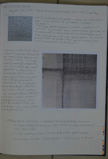

One of my recurring interests is in repetitive mark making. I find it a meditative and calming activity. I sometimes use doodling as a way to relax before going to bed to avoid the stimulation of social media and illuminated screens which tend to exacerbate insomnia. 

I took a closer look at the work of Hilary Ellis a British artist whose work I first encountered at the Jerwood Drawing prize exhibition a couple of years ago. She had used repetitive mark making in stitch which speaks of the often futile repetitive actions of the work of women. I was attracted to the work even before I had read the artist's statement because the marks although very similar were inevitably slightly different because it is impossible to be completely precise and regular when working by hand. Repetitive mark making is something I would like to explore further.


I indulged my obsession by filling a page of my A3 sketchbook with very simplified stick figures each corresponding to a mark made with an orange highlighter pen to represent a life jacket. I though I could use this concept - finding out how many people actually died in the Mediterranean last year and making a very large print on a roll of Chinese paper using either masking or painting for the life jackets and backdrawing for the figures. I did realise that the figures looked almost like crucifixes from a distance which probably isn't appropriate for a population containing mainly Muslim people. I considered actually making the stick figures into numbers because that is how they are presented to us - as numbers and statistics rather than individual human beings. 


The other possibility I briefly considered was using my cartoonish bees in life jacket orange and black instead of yellow and orange, recalling David Cameron's comments last year about migrants swarming into the UK.

Unfortunately, having already missed two deadlines and with another one approaching very quickly I realised I simply didn't have time to execute these ideas. If I ask for another extension there is a risk I will never complete this course. I have decided to submit the combination monoprint I have already produced despite the fact there is significant room for improvement here. It would be possible to go on forever without being sufficiently satisfied to submit my work - I need to stamp on my perfectionist tendencies here and move on. These Ideas will remain available for possible later development. 


References

(1) https://www.theguardian.com/world/2016/dec/23/record-migrant-death-toll-two-boats-capsize-italy-un-refugee
(2)http://www.unhcr.org/uk/news/latest/2016/10/580f3e684/mediterranean-death-toll-soars-2016-deadliest-year.html


Wednesday, 15 February 2017

Bees


The starting point for this series of prints was my experiments with texture. I had used bubble wrap and really liked the texture it produced on a print. It reminded me of the structure of honeycomb so I decided to try to use this with the theme of bees. 

I made a few rapid sketches close-up photographs of bees in my sketchbook. I then made a more detailed and colourful drawing with coloured pencil on black paper.


I created an impression of the bubblewrap in pale grey ink on a monoprint plate by passing through the press. I printed this impression onto black paper. I backdrew the bees onto this texture. I used oil bars on OHP acetate and drew onto the back of the acetate. I also accentuated the hexagonal shape of the honeycomb in a few places and added a bit of yellow/orange colouration using coloured pencils. 

The result wasn't satisfactory. Although I really liked the texture when viewed close up, the visual impact was lost at a distance. The oil bars didn't work well for the small shapes as the thick layer of this pigment resulted in a thick and blobby line when drawn into so the bees were rudimentary at best.


For my next attempt I substituted oil pastels for the oil bars - I also used the oil pastels for the accentuation of the honeycomb. The bees were rendered more precisely on this one but they were lost in the busy background.


For my next attempt I changed to a light background and a thinner Japanese paper. I accentuated the texture by going over the oil based ink with water soluble coloured pencil. The ink resisted the pencil so it really did add to the texture. This time I did the backdrawing using the classic technique with ink on a plate. I only inked the areas where I wanted to draw the bees and I applied a light dusting of talc over the ink. The drawing was much better and the bees stood out well against the light background. They were a bit cartoonish though compared to the lovely texture of the background - I didn't feel the contrast of the two worked particularly well together.


I decided to try a print based on the sketch I did on the black paper. I taped the paper over a large plate and a sketch of the rough position of the elements of the drawing underneath to act as a guide. I used water based block printing ink. I first spread yellow ink in the area of the center of the flower and textured this by pushing the bubble wrap into it. I continued to build up the image of the bee a few marks at a time because the hinged paper - plate arrangement allowed me to look at the results and re-position the paper accurately each time. I used three colours - yellow, magenta and blue without mixing them allowing mixing to occur on the paper. I left areas of the bee's abdomen and eye unpainted so the black paper showed through for the darker tonal areas.
For the next step I used the Windsor and Newton oil bars and backdrawing in white and yellow. This can be seen especially in the frilly stamen structures of the flower and highlights at the front of the bee's legs. 
Because the wings are transparent and the bee is on a dark background, the wings were not standing out well so I decided to draw into the background with coloured pencil. I regretted this - I think it detracts from the overall impact. However, I do think that this print is better than the original idea of bees on honeycomb.


What I learnt

  • Water based block printing inks work well for painted monoprints
  • A combination of this with backdrawing can be quite effective
  • I still need to learn restraint - I went a but too far with the addition of coloured pencil

Sunday, 12 February 2017

Textured and Combination Monoprints: Completely Abstract

During my attempt to make an urban landscape I had, on a whim, placed a piece of cotton thread on the plate before printing. I really liked the distinct line that it produced as a mask especially with the combination of dark blue and bright orange. The quality of the line reminded me of the flowing quality of line produced with continuous line drawing and blind drawing. I wanted to see whether there was a possibility of using thread placed on the inked plate to draw with.


I printed a layer of the sonic orange and then cleaned and re-inked the plate with indigo. It was onto this indigo that I placed the threads as a mask for the drawing which would show  in orange against the blue. I tried a simple drawing based on one of the seagull sketches I did on Ischia. This was much more difficult than I had anticipated. The cotton thread was springy and didn't want to stay where I wanted to put it. I thought that the tacky ink would hold it in place but the problem was getting it to go where I wanted it without touching and disturbing the layer of ink on the plate. The thread had to go down on the first attempt because moving it would have left a mark. The result was a very abstracted drawing of a bird - the one shown below is a second pass of this print. 


I re-inked the plate without cleaning it and had a try at a similar drawing working very rapidly into the plate with a toothpick. You can see the ghost of the previous bird drawing in the background because I didn't clean the plate. The plastic toothpick skittered all over the place on the inked plate with this rapid way of working. The result was scratchy disjointed lines that look less deliberate and more tentative. I much prefer the character of line produced by the thread. 


I had the idea that I could use the two different qualities of the lines in the same drawing using the thread to emphasise certain areas. I tried this with another quick sketch. The problem with this was that having drawn first with the toothpick, I had to try to place the thread precisely in the chosen areas - this was simply impossible so the result was just a random line in the middle of the background area. I would be better to do this process the other way round if at all. 


At this point I was frustrated and I decided that since the quality of the line produced by the thread was my starting point, I would try just to exploit that without attempting anything representational. 

I stuck with the sonic orange and indigo colour scheme as these worked well together and printed in several layers with random arrangements of criss-crossing threads. In some of the prints the threads act as a mask:


In others I have removed the threads after more than one pass through the press and the remaining ink trapped under the threads has produced a line:


I added some yellow to the mix and also added other textures (talc)  and masks of torn paper because I knew that the brief called for multiple techniques. The green stared to remind me of plant cell walls - this theme could have been developed further with back drawing but I felt that these were less successful than the simple blue and orange prints so I didnt go any further down that route.


The two prints that I felt were the most successful from this exercise are shown below. They exploit the fact that as the indigo ink becomes thinner on the plate after more than one pass through the press, it fades to a blue grey. 

In this print the orange shows through brightly where the threads mask the overprinting with indigo. The indigo areas also show a subtle pattern of thicker lines - this is from re-inking the plate with indigo after a previous print without cleaning the plate - I like this double effect. The registration isn't perfect but is close. Unfortunately the photograph doesn't do this justice - it is much brighter and has more visual impact 'in the flesh'.

.


The print below was by absolute favourite. This is a ghost print taken onto coated paper after more than one pass through the plate. Most of the indigo ink has been taken off on previous passes so that the orange shines through clearly. I really like the haloes of indigo around the threads. Between the threads there is a lovely grainy texture from the remaining indigo ink where it hasn't removed evenly from the plate on previous passes. This is an added texture bonus. The whole thing looks as if it is illuminated from behind because of the pale orange. 


I suppose it could be argued that this print doesn't really fulfill the brief of multiple techniques. However, the OCA does encourage us to adapt the briefs to our needs. It could be argued that this print demonstrates the technique of masking and the application of texture. I'm prepared to risk it !


What I learnt

  • Thread produces nice lines but is difficult to handle with precision
  • Indigo and sonic orange are a good colour combination
  • Keep things simple - identify what it is that attracts you and exploit that without over-thinking - respond to what happens on the plate rather than planning too rigidly

Friday, 10 February 2017

Textured and Combination Monoprints: Urban or Industrial Landscape - Final Attempt

When I attended the collagraph/monoprint workshop at Leeds Print Workshop, it occurred to me that the combination of tapes we used to create texture (duck tape, anti-slip tape, masking tape, foil tape and many more) would be ideal for creating the textures of an industrial landscape. The tapes themselves are also used by plumbers and in industrial settings so I liked the idea of using them to produce a print representing their usual habitat. 

I first created a collagraph type plate with several layers of tape. I didn't do any pre-planning of this plate - I just used the shapes I had in my head from previous attempts to represent this subject and let it develop as I went along. I decided to try to create a sense of depth to the landscape by using different tapes for the foreground, middle ground and background areas. I used the thickest tape for the foreground shapes which was the anti-slip tape. This is like thick sandpaper and produces a speckled texture on printing. 
I used duck tape for the mid ground elements which has a texture caused by the threads within it. For the background buildings I used masking tape which has quite a close texture. I attempted to create an impression of smoke from the chimneys by applying crumpled foil tape (the type used for sealing chimneys and ducts) I quite like the irony that I am representing smoke by using tape that is used to keep smoke contained!

I started off by printing directly from the collagraph plate onto cratridge paper. I first printed in process yellow then overprinted in process magenta and indigo. There were some parts of this print that I really liked. The bright yellow haloes around the foreground chimneys, the subtle gradation of indigo and red on the background shapes and the sky as well as the texture for the smoke all worked quite well (although the smoke looked a bit too solid). However I had not managed to register the print well enough and the slight offset created a bizarre effect with the foreground shapes. The offsetting of the little dots of colour produced by the anti-slip tape made my eyes go funny! It reminds me of a blurred photograph or interference on a tv screen and is difficult to look at. 


Three layer collagraph print in yellow, magenta and indigo

I took a second 'ghost' print of the plate onto wet cartridge paper (intaglio technique) - this transferred mainly indigo ink but with very small amounts of the magenta and yellow which remained on the plate. It picked out more detail of the texture of the duck tape.


Single layer collagraph print on soaked cartridge paper

I proceeded next to adapt this collagraph into a monoprinting technique by offsetting the image onto a monoprint plate to allow me to manipulate it further.  I re-inked the cardboard collagraph plate with a combination of yellow and indigo. I then placed a plastic monoprinting plate of the same size directly over it and sandwiched the two between layers of newsprint before passing them through the etching press together. This transferred the ink from the collagraph plate to the monoprint plate. There was still a small amount of red on the collagraph plate so this also transferred especially in the area of the smoke and age background buildings. 
After obtaining my offset image on the monoprint plate I was free to adapt it further. I used cloth and scrim to wipe into the sky and to break up the outline of the foil smoke shapes. I also used the tip of a sharpened pencil to draw windows into the distant building. I pulled the print onto cartridge paper using the etching press. I was quite pleased with this result. Note that the image is reversed by the offset printing process. 


Offset collagraph monoprint three colour print with subtractive
drawing on cartridge paper

I took a second print from this monoprint plate onto coated paper


Second pass 'ghost'  monoprint as above

I then cleaned my monoprint plate and re-inked my collagraph plate with plenty of red and yellow ink. I offset this again onto the clean monoprint pate. This time I decided to accentuate the foreground instead of drawing into the background. I rolled indigo ink onto the monoprint plate and wiped away to leave only foreground chimney shapes. I got a bit confused as to which chimneys were on which side of the print and plate so the shapes are not accurate reproductions of the printed shapes underneath but this adds additional depth to the foreground. The registration is slightly off. 


Multilayer collagraph monoprint

I took a ghost print from this and then overprinted again with additional yellow. The registration was not great but his gave a dirty smudgy effect which I think is quite appropriate for the subject matter. I realised it was time to stop at this point before I managed to create mud from too many layers of mixed colours. 


Multilayer collagraph monoprint

What I learnt

  • A makeshift collagraph plate can be used to create landscape textures
  • Offsetting the collagraph onto another plate allows additional manipulation of the image
  • Spontaneous working without too much planning is sometimes better that having too fixed an idea of the outcome you want as it allows you to respond to whet actually happens when you print


Tuesday, 7 February 2017

Textured and Combination Monoprints: Urban or Industrial Landscape - 2nd Attempt

I was inspired to look at industrial landscapes by Cath Brooke. Viewing her work made me nostalgic as she does a lot of her sketching and searching for ideas in the industrial landscape around Redcar and Teeside which is where I grew up. There was nostalgia for my youth and sadness for the fact that a lot of the heavy industry in that area is no longer functioning. 

I started by looking for photographs for reference material online and made a few sketches in my sketchbook. 


Sketchbook page: Industrial landscapes
sketched from photographs

I also looked at some industrial landscape monoprints by Kate Dicker R.E. Click Here to view Kate's Website. I love the textural quality and the atmosphere created by the colour in these monoprints. I think they have been made in multiple thin layers painted directly onto the plate. There are marks made by the flicking of solvent present as well as wipe marks and there is a great balance in the relative prominence of light and dark shapes.

Sketchbook page: Visual Research
Industrial Landscape Monoprints
Kate Dicker


The project called for a multiple techniques so I decided I would attempt to create a multilayer print using masking or stencils for the main shapes of the buildings and textural elements for the fiery, smokey , sky in the background with perhaps a bit of backdrawing. 
I created positive and negative masks of industrial buldings based loosely on my coloured pencil sketch. I printed the buildings in black using the negative mask on dampened Somerset paper. I then used the positive mask to print the sky. I planned four layers, pale yellow, sonic orange, red and a dark purple. 
I printed a uniform pale yellow over the sky and then sprinkled talc over it. I overprinted subsequently in orange, red and purple. Unfotunately, by the time I got to the purple layer, the paper was almost completely dry despite having laid it between some sheets of damp newsprint. This, combined with the fact that I had put too much linseed jelly in the purple ink meant that the purple hardly printed at all - instead of covering some of the areas of orange and red and providing tonal contrast to balance the dark shape of the buildings at the bottom, all it did was create a pale stain which made the underlying ink look slightly duller - this was not the intended effect.The large amount of talc I had put on the plate also didn't help because it ended up on the paper and dried the ink on contact making each subsequent layer more difficult to print. I also practised a bit of back drawing adding some further industrial shape in the background. I had two attempts at this but wasn't satisfied with either result. As well as the problems with the purple ink not taking, the registration wasn't satisfactory. 


Multilayer masked and textured monoprint.
Industrial Landscape


Multilayer masked and textured monoprint. 
Industrial Landscape

I decided to try again pulling a print by hand onto thin Japanese paper. I used the same masks but developed the sky differently by using additive and subtractive painterly monoprint techniques. I added ghostly back drawing for more distant buildings and structures  I used a dry brush technique quite extensively and this gave an appropriate smokey and dirty feel to the landscape. Unfortunately I then ruined it because I thought it needed some flashes of vivid colour like my sketch. I applied far too much of the sonic orange and pink without using any transparent base. I had also made the edges of the paper very dirty with fingermarks and smudges of ink so had to trim the paper down. 


Multilayer masked and textured monoprint. 
Industrial Landscape

I was starting to get frustrated with myself and considered abandoning this subject at this point but I was determined not to let it beat me. 

What I learnt

  • I need to keep the paper wetter if overprinting in multiple layers on thick paper
  • Too much talc is not a good thing - it will make ink transfer in subsequent layers more difficult
  • Dry brush techniques can add interesting texture
  • There is a risk of going too far and adding too many layers if you get carried away. 

Things to do and try

  • I need a better way to keep the paper moist
  • Try working faster
  • But at the same time learn restraint - know when to stop- use judgement and discernment - this will take a long time to learn!

Wednesday, 1 February 2017

Textured and Combination Monoprints: Urban or Industrial Landscape - 1st Attempt

There has been a long gap between my posts because unfortunately I had some health problems in December and January but I'm fully recovered now and pleased to be getting back into the course. Now for the final project of part 1:

You have explored and used a variety of monoprinting techniques. They range from smooth single coloured layers to more complicated textures, lines and coloured layers.

Taking into account the opportunities for a different size and colour range in a single monoprint,  this project allows you the freedom to create prints from your own subjects ad imagination which combine two or more of the techniques you have already experienced. 

Try to find four contrasting subjects which will lend themselves to the different techniques...You can make several versions of the subject so that you have a selection to choose from before you send your work to your tutor. 

For my first subject I hit on a 'hard' landscape - either  urban or industrial. I had been frustrated and dissatisfied with my previous efforts to work with this subject and I had also been inspired by the techniques demonstrated and by the work of Cath Brooke Click Here to link to Cath's website  to look at industrial landscapes. 

I tried employing some of the techniques demonstrated by Cath - namely a combination of drypoint and monoprint with textured Chine Collé - to get to grips with the New York skyline after Stieglitz's photograph.  It was the very first time I had tried drypoint but I had read about it so thought I would have a go. I scratched the image into the plastic plate using an etching needle and another tool that created several lines at the same time. I then applied a thin layer of hawthorn stay open ink mixed with a touch of linseed jelly and rubbed it into the etched lines before wiping it away. I printed it onto damp paper using my tiny etching press.

Printing plate - drypoint etching of
cityscape after Stieglitz

The print was a little bit thin but not bad for a first attempt - this may have been for a number of reasons: too much linseed jelly, too much wiping, insufficient soaking of the paper. I would like to attend a class on drypoint to pick up some tips. I went on to print several of these - this is the advantage of using a drypoint as a base for a series of monotypes as it is relatively easy to have several prints to start with so you can afford to experiment (although the number of prints that can be taken from drypoint is limited by how long the delicate burrs  last).


First print from the plate


I had already prepared some Chine collé tissues with texture by rolling black ink over the tissue while laid over samples of textured wallpaper and crumpled foil (a bit like frottage/rubbing but using printing ink). On my next print I applied the Chine collé using permanent spray mount at the same time as printing the first layer with the drypoint. It is important to do this in the first layer as it needs to be in direct contact with the paper. It will not stick over the oil based ink. In the image below the chine collé is representing windows on the distant skyscraper (a texture from wallpaper) and representing cracks in the rendering in the upper building on the far left (texture from crumpled foil). I was quite pleased with the textural effect but went on to overprint with two monoprint layers. First I rolled a graduated dark blue to pale orange over the upper part of the plate before masking off the skyline to print the sky. The result wasn't so great - it was a bit grainy - the paper was drying out and I may not have added sufficient ink. 
Subsequently I masked off the area of the sky and overprinted a pale yellowy cream colour for the buildings.


After Stieglitz - Drypoint, Chine Collé and
monotype


I wasn't happy with this first attempt for a number of reasons. I hadn't really planned what colours I would use. I realised that having a dark sky relative to the buildings was problematic. Firstly because the more vivid colours of the sky were overpowering the buildings and jumping out at me. Secondly because I had chosen to make the windows dark on the buildings. Windows look dark during the day but at night you can't really see the windows unless they are illuminated. 
I had hoped that the hatching on the buildings at the front would be sufficient to make them more dominant and bring them forwards creating a sense of pictorial depth even if all the buildings were printed a uniform colour. This was not the case, especially with the addition of texture to the most distant skyscraper. A rethink was required. I tried out some colour schemes in my sketchbook


Sketchbook page trying out colours

I decided to keep it simple and just use different shades of the same colour (sonic lipstick pink). I again printed and applied the chine collé on the first pass. I masked off the distant buildings and sky and printed the foreground buildings in the vivid pink. I then added more linseed jelly and transparent medium to the ink. I inked up and wiped away the areas which I didn't want to print before printing the paler colour for the sky and the distant buildings (leaving the front of the distant skyscraper without overprinting). Unfortunately by this time, the paper was drying out so the sky came out grainy - I need to keep the paper moist in some way or work more quickly. 
The choice of colours wasn't great - the colour overpowered the drypoint and the registration was not great which really shows when you are using such a vivid colour.


Second attempt: drypoint, chine collé with
overprinting in shades of pink


I decided to try embellishing the drypoint by the addition of watercolour instead:


Drypoint and Watercolour 


This was somewhat better in terms of result but felt like cheating in terms of process. I realised that I was not demonstrating any of the skills I had used in part 1 so it wouldn't be a suitable assignment piece. 


Drypoint and watercolour textured with
impressions from kitchen roll


I then tried out monoprinting using water soluble coloured pencils as I had tried this at the beginning of part one and quite like the effect. I coloured the areas corresponding the the buildings and the sky quite thickly using the coloured pencils on a separate plate of the same size. I then overprinted this layer on top of the drypoint on very wet paper. The coloured pencil doesn't print evenly so the pencil marks create marks themselves which adds texture. This was somewhat helpful for the texture of the buildings but a bit distracting on the distant sky. 


Drypoint overprinted with water soluble
coloured pencil on wet paper

There was still quite a lot of the coloured pencil left on the plate so I had another try. This time I also experimented by not wiping the drypoint plate so completely - leaving a small amount of ink especially around the edges. This combined with the thin layer of remaining coloured pencil gave a more subtle effect and looked quite grey and grimy which is suitable for the subject matter. The small amount of remaining coloured pencil has given a subtly textured effect which is not overpowering. This was my preferred print of the bunch. 

Drypoint, incompletely wiped and overprinted
with a second pass of soluble coloured pencil

Ultimately, although I was more satisfied with my final print, I felt that this print was more about the drypoint then the effect of the monoprinting and therefore wasn't really right to demonstrate more than one technique from the unit. I learnt a lot with this process but probably won't be submitting this one to my tutor. 

What I learnt

  • I like drawing in drypoint
  • Drypoint can be combined with many other techniques to create monotypes
  • Think about the layout of colours before you start printing
  • Chine collé is very fiddly and sticky but can produce interesting effects
  • It is possible to print more than once from a plate coated in soluble coloured pencil
  • Incompletely wiping the drypoint plate is a good way to manipulate the image
  • Letting the paper dry out before overprinting means it takes the ink less well and also makes registration less accurate because it shrinks slightly

Things to do and try

  • Go on a drypoint course/workshop to learn more about this technique
  • Get more creative with regard to wiping the drypoint plate
  • Work faster of find a way to keep the paper wet between printing of additional layers