Thursday, 22 September 2016

Reduction Linocut Workshop at WYPY

On 17th and 18th September I attended a weekend workshop at West Yorkshire print workshop tutored by Scarlette Homeshaw. Click here to link to Scarlette's Website. 

Scarlette produces highly coloured reduction linocut prints in many many layers. Her work often features architectural or industrial features but the colour schemes are very vibrant. 

Before the course, out tutor sent us some suggested reference material in the form of links to websites which I've added here for my own future reference. 

http://greatnorthartshow.co.uk/the-history-and-process-of-linocut-print-from-paupers-to-picasso/
This gives a brief history of Lino printing

http://www.kevintraditionalprintmaker.co.uk/index.php/process/
Kevin is the artist who taught Scarlette the reduction process - this gives an explanation of his approach. It takes you through a print from start to finish which has about 17 layers to it and is very complex.

She also suggested to looks at the work of Arthur Homeshaw. Click here to link to images of his work on the Artizan Gallery website 
His linocuts are, once again complex and in multiple layers and he seems to be inspired by the local landscape and the elements - he seems to like angular trees misshapen by years of fighting against the wind. Obviously none of us on this beginners course were going to produce anything like this but nevertheless looking at these sites showed us what was possible and was therefore inspiring. 


Day 1:


I had prepared some sketches which were about A5 in size and which I though would be suitable for a reduction linocut. I wasn't that enamoured with the design to be honest - it seemed a bit stiff and twee but I thought it would be straightforward design to get started with. However, when we arrived we were given square pieces of Lino to cut. My composition would not really adapt to a square format so I abandoned it. 


Scarlette often uses photographic imagery as her inspiration but photocopies it into black and white so she won't be unduly influenced by the original colour scheme. I had Brough some photographs with me and settled on a close up of my cat's face. (The cat's name is 'Princess Suzie' -named by my son when he was 6 and a complete misnomer as she is not at all refined but an expert hunter who decimates the local rodent population - giving her the nickname 'killer queen). 


I traced round areas of markedly differing tonal values and colours and then transferred the tracing onto the lino. I re-inforced the drawing with biro as the pencil would have rubbed off after the first printing and cleaning of the lino.


For the first cut of the lino I cut away all the areas which I wanted to show as the white of the paper - the stripe down the centre of her face, highlights on the eyes and the whiskers. I realised I had made life difficult for myself by drawing dots to represent where the whiskers come out of the face - this meant I had to cut around these small dots - It was difficult so I couldn't afford to be a perfectionist about it - I lost some of them and some remained bigger than I would have liked but this seemed to make them more organic so I wasn't too concerned about that. 

We used the grey hessian-backed lino and it wasn't a warm day which made it more difficult to cut. I had heard that putting the lino on a radiator or using a hairdryer on it can help. However, Scarlette warned us that this can sometimes make the lino brittle because of overheating. She suggested we sit on out lino for few minutes to warm it slowly to near body temperature - this worked quite well. I had also invested in a couple of Swiss made cutting tools (one U shaped and one V shaped) which were very sharp and really aided my cutting.

For the first print layer I mixed up a pale fleshy pink colour using lots of opaque white with a touch of red and yellow. Because we were using the Hawthorn 'stay open' inks and we wanted them to dry more quickly to add more layers, we added cobalt driers to the ink when we mixed them up. 

We made a registration guide by placing the lino white we wanted the print to be on a piece of paper the same size as that onto which we would be printing. We drew round the lino then marked one of the corners (the lower left corner) so as always to register the lino to the same corner. We also marked 'top' so we'd remember which way round to place everything. 
We were making an edition of 5 so I printed 5 of my first layer of fleshy pink using the relief press (platen press). You could see an outline from the black biro on some of them but Scarlette assured me that this would not show once further layers were added (and she was right). 

Next I cut out the areas I wanted to remain pink. That included some of the whisker pores, the nose and the third eyelid. By this time (because we had also spent some time on explanations and demonstrations) there was not time to print the next layer. 


Day 2:

I started by printing the next layer in a pale green. I then went away and cut out the irises of the eyes which were the only truly green areas. 

I waited as long as I dared to allow as much drying time as possible but it was obvious that the old based ink wasn't really going to dry in a few hours so we had to print wet onto wet. 

I mixed up a pale yellowy beige colour for the next layer. Of course this mixed with the underlying green but it produced quite an exciting and vivid almost luminous green. I found the process of registration quite nerve-wracking as it was so easy to get it slightly out and I was paranoid about losing the cat's whiskers. 

Next it was time to cut the tabby markings. I was able to go to town a bit more with this with making marks - I enjoyed this bit the most as I didn't have to really stick to the lines religiously. I then overprinted with a very dark Prussian blue. 

There was a but of a grainy texture to the final prints because of the wet-into wet printing and the registration was a bit variable, but overall I am pleased with the results for my first attempt at reduction linocut. Scarlette was a good teacher and I thoroughly enjoyed the course. 


I had to wrap the wet prints in newsprint to transport them home. Some ink transfer occurred onto the newsprint giving a sort of 'counterproof'. I drew into this with a pen and placed it in my sketchbook. 


Tuesday, 20 September 2016

Research Point: Degas Monoprints

Look at Monoprints by Degas. How have these been achieved? How Successful are they? Take a close look at one or two of his prints, print them out an annotate them. What can you learn from his prints? Make notes in your learning log. 

Degas was first introduced to the monoprint technique by a fellow artist Ludovic-Napoléon Lepic. In fact the first monoprint signed by Degas was also signed by Lepic which suggests they collaborated on its production. The image is shown below and shows rehearsals at the Paris Opéra.(1)


(1)The Ballet Master (Le Maître de ballet) c.1876 Degas and
Lepic. White chalk or opaque watercolour over monotype
on paper
After his first introduction to the technique. Degas became very prolific and almost obsessive with the technique. He produced large numbers of works (over 300) in two discrete periods of his career from the mid 1870s to the mid 1880s and a shorter period in the early 1890s (2).

His obsession with this way of working was noted and remarked upon by fellow artists, such that he started to be identified with the materials - almost as if he had lost himself in the medium. To quote Marcellin Desboutin in 1876 Degas " is no longer a friend, a man, an artist! He's a zinc or copper plate blackened with printer's ink, and plate and man are flattened together by his printing press whose mechanism has swallowed him completely!" (2)

This obsessive concentration on the technique served him well and he produced wonderful lively monotypes. He was so familiar with the technique and medium that he was able to really push the monotype as far as he could and to improvise. Many of the works seem to have a spontaneity about them and this makes them lively and exciting. They look as though they have been rapidly executed and so contain the artist's energy. Degas described his monotypes as " drawings made with greasy ink and put through a press" (2) which tells us something about the process of their making but only takes us so far. More can be gleaned from looking closely at the prints. 


How have these been achieved?


Degas mainly used plates made from copper or zinc. He also occasionally used daguerreotype plates and celluloid (having the advantage of being transparent for tracing images but not generally his preferred type of plate) (3). He used oil based ink which was designed for etching (ground pigment mixed with boiled linseed oil) and he added small amounts of brown of blue pigment to make the colour warmer of cooler. He worked both in an additive manner and in a subtractive manner - that is he produced prints with a light background by painting and drawing with the ink onto the plate and he produced prints with dark backgrounds by covering the plate with an even layer of black ink and then drawing in negative by removing ink with various tools (3)

The dark field (subtractive) monotypes were printed from larger plates than the light field ones. This is perhaps because he found removing ink with rags and brushes was too difficult on a small plate - he needed more space as the tools are relatively clumsy.(3)

For the additive monotypes he diluted the ink to make it less viscous and facilitate application with brushes and fingers. In the example in figure 2 below, the ink seems to have been manipulated rapidly. The faces are not definitively stated but only suggested which gives a feeling of movement. 


(2) Head of Man and Woman (Home et femme, en buste)
c. 1877-80 (British Museum London)
With subtractive monotypes he used a more viscous ink because it would stay put and not obscure the marks he made by removing it. 

(3)The Fireside (Le Foyer (la Cheminée)) c. 1880-85
(Metropolitan Museum of Art)
He made the marks on the black ink by rubbing with stiff brushes, his fingers, rags, wooden brush handles and sponges. He also sometimes applied solvents (3)

Many of his monotypes employed a combination of subtractive and additive methods. Such as the example in figure 4. 

(4) Pauline and Virginie Conversing with
Admirers(Pauline et Virginie bavardant avec 
des admirateurs) c 1876-77


For this print he started by painting the dark figures and the corridor using different concentrations of ink for the different shades of grey and black. He has used some quite thin washes of ink in places. He then created the effect of light streaming in through the doorways subtractively by wiping away ink. (3)

In his later phase of monoprinting, in which Degas produced predominantly landscapes, he experimented with using oil paints instead of printing inks. This increased the unpredictability of what would happen in the press as the oil paints were more likely to run and move about than the stiffer inks. Unfortunately, with the passage of time the ink has leached out of the oil paints into the paper leaving a 'halo'. 

(5) Landscape (Paysage). 1892 - Pastel over monotype in oil on
able paper (now faded to off white) mounted on board
(Metropolitan Museum of Art)
These landscapes are simplified almost to the point of abstraction. This reflects the way he worked on these. They are not made from direct observation of the subject. He was inspired to produce these monotypes by the view from a train journey. Maybe this vagueness comes from the fleeting glimpse of the passing landscape? Or perhaps it could be because time passed between seeing the landscape and being near a press to produce the images? Either way it seems to be a deliberate move away from detail and over-stating. Degas said that it was important to reproduce only what "struck you, that is to say the necessary. That way your memories and your fantasy are freed from the tyranny of nature".(4)

I have used the term 'monotype' throughout this description of technique, because in many cases, Degas produced more than one image from a single plate. He would often pull a second 'ghost' print (or 'cognate') from a plate after the first print. He also produced 'counter proofs' - that is he printed from the surface of a wet print onto another piece of paper resulting in a reversal of the image. (2). In some cases he altered the image between the first and second print by adding more ink or paint in places producing different 'states' of the same print. (2)

Where cognates or counter proofs were produced, in may cases Degas worked back into these using either pastel, opaque watercolour or a combination of media to produce more detailed drawings. As in the example below:

(6) Three Ballet Dancers (Trois danseuses) c 1878
Monotype on paper (Sterling and Francine
Clark Art Institute)
(7) Ballet Scene (Scène de ballet) c. 1879 Pastel over monotype
on paper (William I. Koch Collection)
As well as the ink used, the paper choices are also important. Degas used China papers, western laid papers, western wove papers and occasionally Bristol board. (3) His choice was dependent on what kind of image he was aiming to produce. The asian papers were thin and absorbent and took the ink very well so they could be used if he wanted delicate brush marks to be seen. (3)

Laid paper has a marked texture because of the way it is produced. This texture is exploited and gives texture to the ink in his monotype of ironing women. This reduces the crispness and legibility of the shapes and therefore contributes to the illusion of movement:


(8) Ironing women (detail) (Les Repasseuses) c. 1877-79
(private collection)


How successful are they?

Very! is the flippant answer to that question. However I will go into some more detail about why I think these are successful works: 

Firstly, thinking about them in the context of the impressionist movement which had turned the norms of fine art on its head by starting to elevate the everyday into a suitable subject for works of art, the monotype is a way of working rapidly. In this way the aim of reproducing a fleeting sensation is served well. (1). For example in figure (2) 'Head of Man and Woman', the faces are barely legible. This really gives a sense of motion perhaps in a bustling Parisian street. 

My personal favourites are the dark ground images of women going about their ablutions or lounging around and getting in and out of bed. Such as the examples shown below: 

(9) The Tub 1876-77 (Biblioteque l'institut national
d'histoire de l'art - Paris)
(10) Woman Drying Her Feet (Femme
s'essuyant les pieds, près de sa baignoire)
1880-85 (Musée D'Orsay, Paris)
The subtractive way of working here achieves a wonderful quality of light - it is particularly effective for giving an impression of low lamplight in a darkened room because there is marked contrast between light and dark but the forms are not clearly delineated and seem to almost dissolve into the gloom. It looks as though Degas had drawn with the light itself. Crucially, however he has known when to stop drawing in order to give just the right amount of suggestion of form to make it legible but without being so overt as to lose the mystery. There is a balance here between the honesty of depiction of the everyday and the execution in leaving some concealment to allow for the use of the viewer's imagination. 

There is perhaps something a bit furtive or voyeuristic about these images. They are all images of prostitutes and you can almost imagine the artist lurking in the almost-dark and capturing their private unguarded (and nocturnal) moments. Are these simply erotic for the purposes of titillation or are they exploratory tonal studies in which the subject matter is incidental? It is difficult to be sure. These monotypes were not displayed until after Degas's death and he didn't mention them in his writings. It is therefore not possible to know his motivation. (5)

Around the same time as these images were reproduced, the advent of photography had resulted in the appearance of pornographic images of naked women. Some of Degas's models assume similar poses to the women in these photographs. However the distinction is in the fact that they are pictured as an integral part of their environment and they do not engage with the viewer but carry on with their activities without appearing self conscious. Also they do not have the same stark realistic precision as a photograph does. Raisa Rexer says- " In this comparison with pornography, the seeming illegibility of the brothel monotypes, the strange dissonance between their indecent content and their compositional innovations, resolves into clarity. That dissonance is their achievement: a simultaneous evocation and disavowal of pornography, a form whose significance rests on the content it belies. The two qualities that seem so opposed are in fact completely intertwined. Degas's feat is equally remarkable in social and aesthetic terms; whatever his personal involvement with the prostitution industry may have been, he created images that constitute as much an exposé of the traffic in the female body as they do an artistic revolution"(5)

The later, landscape monotypes are also successful apart from in the choice of oil paint on paper which has resulted in leaching of oil in to the paper. My preference, however is for the more abstract pure monotypes which have less legibility in terms of form and pictorial space and are more abstract and more about the marks made by the medium. In many of the monotypes, Degas has worked over them extensively with pastel making them more obviously impressionist drawings. The purer monotype versions remind me to a certain extent of Turner's sketchbooks in their simplicity. 
In the example below, the subject matter can be just about read with reference to the title but is not explicitly stated. 


(11) The Road in the Forest (la Route dans la Forêt) 1890
(Harvard Art Museums/Fogg Museum)

In contrast -  figure 12 has been worked into with pastel and the drawing made much more legible. The shimmering dots of colour are quite beautiful but this owes more to the pastel drawing rather than the underlying monotype:


(12) Landscape with Rocks (Paysage avec rochers). 1892
Pastel over monotype in oil on paper
(High Museum of Art, Atlanta)


Take a close look at one or two of his prints, print them out and annotate them. 

I have annotated some prints in my sketchbook:

(13)Woman in a bathtub (Femme au Bain) c 1880-85 (private collection)


  • Subtractive (dark ground) monoprint
  • Landscape format
  • Rim of bath draws eye in circular motion
  • Taps draw eye back onto the woman
  • Focal points - face (highlight on ear), foot
  • Arm washing leg creates diagonal up towards the foot. 
  • Light source in upper left but generally very dark
  • large vocabulary of marks
  • light brush marks in the background
  • Bright contrasting lines on tap reflective surface poss made with a piece of card or a palette knife?
  • Back part of bath probably rubbed with a rag
  • Stippled effect on face ? tip of a stiff brush or small spatters of solvent?
  • More distinct brush marks in the water
  • Foreground edge of bath and highlights on foot probably made with a brush handle
  • Face primitive (neanderthal/simian)
  • Hands and feet are chunky and clumsy 
  • Analogy between the wiping action of the woman and that of the artist


(14) Woman in her Bath, Sponging her Leg (Femme dans son bain s'épongeant la jambe)
c 1880-85 (Musée d'Orsay, Paris)
  • Cognate overdrawn with pastel
  • Very different to the first impression - 'prettified'
  • Much more light flooding in and reflecting from the water - daylight - the other looks nocturnal
  • Face hands and feet are more refined
  • Taps are missing and bath is a narrower ellipse
  • Does not engage with viewer only her own body
  • Looks like she is really getting clean - in the other the water is murky
  • ? less of an honest impression of the brothel scene-made more palatable deliberately
  • Less raw/base

What can you learn from his prints?


I have enjoyed researching this subject and there are several points I can take away from this in going forward:

  • Keep trying! Degas learned to handle his medium by being prolific and pushing forward
  • Try diluting the ink more and making washes in additive monoprints
  • Stiff, viscous ink is good for subtractive work
  • Use a combination of both additive and subtractive- keep manipulating the ink until you get what you want
  • Consider the effect of the texture of the paper and exploit this where appropriate
  • Oil paints on their own will produce an oily halo
  • It is possible to build up a large vocabulary of marks with simple tools
  • Dark ground monoprints are especially good for tonal contrast
  • It is not necessary to be too literal in your drawing (nor is it often possible)
  • Chance will play its part - is is not always possible to entirely predict what will appear when pulling a print- things can change in the press or hand printing process


References:

(1) R. Kendall, "An Anarchist in Art: Degas and the Monotype" in "Degas: A Strange New Beauty" J. Hauptman . MoMA, New York, USA 2016 pp 20-36

(2) J. Hauptmann, "Introduction" in Degas: A Strange New Beauty" J. Hauptman . MoMA, New York, USA 2016 pp 12-19

(3) K. Buchberg and L. Neufield, "Indelible Ink: Degas's Methods and Materials" in "Degas: A Strange New Beauty" J. Hauptman . MoMA, New York, USA 2016 pp 47-53

(4) J. Beyer "Movement and Landscape" in "Degas: A Strange New Beauty" J. Hauptman . MoMA, New York, USA 2016 pp 177-179

(5) R. Rexer "Stockings and Mirrors" in "Degas: A Strange New Beauty" J. Hauptman . MoMA, New York, USA 2016 pp 137-141


Image Sources:

(1) https://images.nga.gov/en/search/do_quick_search.html?q=%221964.8.1782%22

(2) https://blogger.googleusercontent.com/img/b/R29vZ2xl/AVvXsEhr54cULyRFbAGCWw0w7Z-SNkwWWi6crblVPp7Q_l4A_Sj_kW3LwVFCSXxVNm70WmFklltFrBFqRGA92862dA6BBXrG8Es4HAsUb1Q0EgSQjp64r7G2yiBjyjjwma2FRP0kBf-de33lQS4/s1600/2.+headsofamanandawoman.jpg

(3) https://static01.nyt.com/images/2016/03/25/arts/25DEGASJP1/25DEGASJP1-superJumbo-v3.jpg

(4)http://assets1.bigthink.com/system/tinymce_assets/2545/original/paulineandvirginieconversing.jpg?1462193990

(5) http://www.metmuseum.org/toah/images/hb/hb_1972.636.jpg

(6)http://www.frick.org/sites/default/files/exhibitions/objects/Clark_09_1955_1386_Final_2000.jpg

(7)https://blogger.googleusercontent.com/img/b/R29vZ2xl/AVvXsEjrZnpQkV8WDzf1bx9P5937a7GUHibU6xCuMal4k-Ds3pxsWsLTiwkx-JVb208OU5-l1hM9o0yiASB5jbTQIyeX-zqcf21158CifRjz5f0noI6KZK8cgxD2ZTmt4RFUrqlFzYHv7vc6LRg/s1600/5.+++balletscene.jpg

(8) https://pbs.twimg.com/media/CfdO2S3XEAAR_AA.jpg

(9)http://65.media.tumblr.com/7f64d835a0d0bbbd685de891f9995df9/tumblr_inline_nnf6r8FzT51t5b0i6_1280.jpg

(10)https://s-media-cache-ak0.pinimg.com/236x/0c/6f/d5/0c6fd552f60c86b2d4a6b6441fd72e6d.jpg

(11)http://ids.lib.harvard.edu/ids/view/17825801?width=3000&height=3000

(12)http://1vze7o2h8a2b2tyahl3i0t68.wpengine.netdna-cdn.com/wp-content/uploads/2016/04/moma_degas_landscapewithrocks-e1459528081497.jpg


(13)https://modernartnotespodcast.files.wordpress.com/2016/04/degas-woman_in_a_bathtub-c-1880-85.jpg?w=1100

(14)https://modernartnotespodcast.files.wordpress.com/2016/04/degas-woman_in_her_bath-c-1880-85.jpg?w=1100

Sunday, 18 September 2016

First Monoprints Day 2: Further Experiments

What I did:

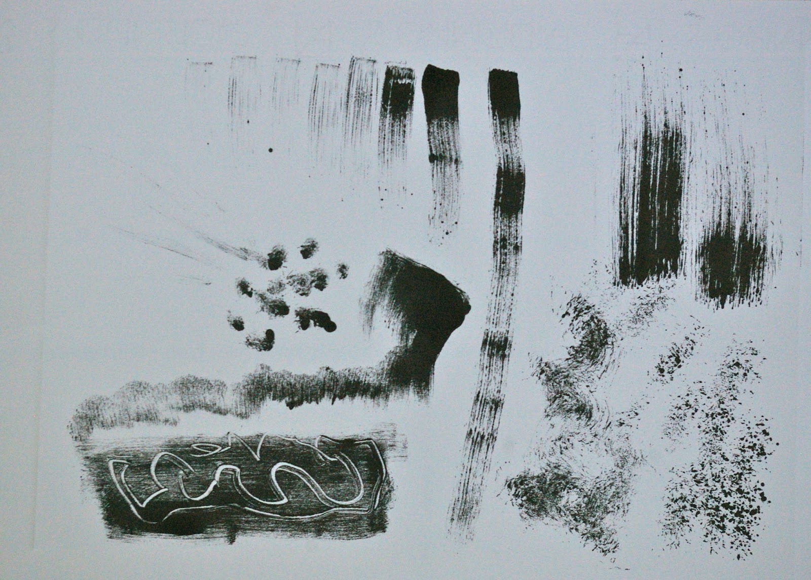
Today I decided to keep thinks simple by using only black ink in order to concentrate on investigating the different marks I could make. I added a small amount of liquin to the Hawthorn 'stay open' oil based ink in attempt to make it easier to work with. I still found it very tacky. I made marks with a variety of brushes by dragging the brush across the plate giving a dry brush effect and then by stippling and rolling the brush. I applied sufficient ink that I was able to take two prints from the plate. I used thin plastic plate which was approximately A4 in size and used my tiny etching press to pull the prints onto thin cartridge paper.


Next I tried working subtractively. I rolled a thin layer of ink across the whole plate and removed the ink in various ways. I used the tip of a pencil and the wrong end of a paintbrush to scratch out sharply defined lines. I used the edge of a small piece of cardboard to scrape out some ribbon-like marks. I used a rag and my finger to rub away ink. In one area I added a small amount of turps. Waited a few seconds then dabbed it off before printing. 


I took a second 'ghost' print from the same plate.


I then selectively re-inked certain areas of the plate with the roller and made more marks with the edge of the cardboard and the end of a paintbrush. I also placed my gloved palm on the surface of the ink which removed a small amount of ink. I then drew into this hand-print with cotton buds and a pencil. I also added a splash of turps again.


I placed a large blob of thick red ink on the plate as well as creating a thick wiggly line of the ink with a brush. I then took a roller and rolled a thin layer of black ink over the top. The thick red ink resisted the black and the roller also picked up the red ink creating a repeating pattern chi I found quite interesting. 


Next I cleaned and re-inked the plate with black ink. I placed a small pool of turps on the plate and tilted the plate to make it run about. I left it to dissolve the ink for a few seconds and then dabbed it off. I really liked the random organising curving lines this made. However, there was an area in the corner I didn't like so I printed again on top with red aiming for an effect a bit like a rose. I put too much red ink on here and it really didn't work. 


It looked a bit more like a rose on the second print from the same plate bu the rest of the print was now too pale relative to the rose. I wished I'd left it alone. 


I really still liked the marks in other areas of this print though so I experimented by cropping in various ways - it works much better when cropped as an entirely abstract print. You can see in the cropped version that the rolling of the ink wasn't entirely even and there is a graininess to the print on cartridge paper. I really like these characteristics however - even if they might be considered faults. 


What I Learnt:

  • I like subtractive mark making on a film of ink
  • Solvents can create interesting marks especially when allowed to run
  • Rolling one colour of ink over another can create interesting repeats
  • If one part of a print doesn't work you can keep parts of it which are interesting


Friday, 16 September 2016

First Monoprints: Day 1

With your printing plate in front of you begin to make patterns of colour using your ink and brushes. Use different brushes for each colour. Remember to leave some plate unpainted - this will print as white (or the colour of the paper you are using). 

What I did:

I used a plastic monoprinting plate that I had been given on the workshop I attended which was about A4 in size.

I was surprised by how very thick and tacky the ink was and when I first tried to make marks with a brush I found I could only create 'dry brush' marks. I also tried applying ink with a palette knife and my gloved fingers. The ink really didn't flow well. I tried adding some linseed oil as I didn't have any plate oil. My linseed oil was very thick and didn't really help very much. 
I tried adding some liquin (oil painting medium) because that was thinner and that worked better but I still found the ink really quite hard to handle.

I made some marks and pulled my first print onto cheap cartridge paper using my little etching press:


So far not really impressive. I did quite like some of the dry brush marks but I also really wanted to be able to make a wider variety of marks and to be better able to control the marks I was making. More experiments followed. I wiped the plate and tried again:


I realised I had not wiped the edge of the plate and I had not replaced the newsprint under the plate so the edges of the paper had unwanted ink on them. I had put on some very thick areas of ink - these just spread out when they were put through the press giving unpredictable results. 

Because the ink was thick there was a lot left on the plate and I was able to pull a 'ghost' print which was more grainy and less intense than the original. 


This time I just added additional ink to the ghost image on the plate so echoes of the previous print can still be seen coming through where the ink was thickest. I mage marks by wiggling and dabbing with brushes of various shapes:


I then tried really going overboard with the ink. I put a thick area of oily red ink on the plate then tried rolling a thinner layer of dark green ink over the top. The roller also picked up the red and made a second red mark. I liked this repeating effect. I also liked the fact that the green and red went over each other only in a couple of places - the oily red seemed to resist the green. I liked the texture that the roller put onto the thick ink- but of course this did not transfer onto the paper. The press squeezed it flat and spread it out. 
(The ink on this print was very very thick - being oil based ink it took more than two weeks to dry completely)


Because the ink was so thickly applied I was able to take two 'ghost' prints from this plate. The first one still had some quite vivid areas:


The second was thinner and grainy but could be a great base for overprinting or drawing into with other media:


I made some more marks by twisting palette knives and edges of cardboard with ink applied:


I also made some quite interesting marks by applying ink thickly and then scraping it back with a palette knife:


To clean up I rolled the remaining ink from the roller onto some scrap paper. I liked some of the marks that this made too. One area reminded me of an alien or of Munch's 'the scream'. I tore  a couple of the pieces of scrap paper away. I drew into them with pencil and stuck them in my sketchbook:


What I learnt:

  • The hawthorn stay open ink is too tacky to use unadulterated with a brush unless you are aiming for dry brush marks
  • Liquin gave better results than linseed stand oil but the ink was still very thick for painting with
  • Thick oil-based ink takes a very long time to dry
  • Thick wet oily ink will resist being rolled over with undiluted ink and be picked up by the roller for a repeating pattern
  • A variety of tools can produce a variety of marks
  • The texture of the ink on the plate doesn't transfer to the print if you put it through the press
  • I learnt some of the foibles of my little press too- in particular not to overdo the pressure as its just causes the plate to slip

Things to learn and try:

  • Keep trying ways to dilute the ink to make it easier to handle
  • Try monoprints with water based inks
  • Try subtractive techniques
  • Try different plate types
  • Try different paper types
  • Try oil paint mixed with printing medium 


Wednesday, 14 September 2016

Part 1: More Preliminary Research - UCA Videos

I watched a series of useful videos in the 'resources' section of the printmaking 1 course on the OCA Student website and made some notes:


https://www.oca-student.com/resource-type/video/printmaking-pt1-introduction-uca-video

Part 1:

  • Use barrier cream or gloves and apron with oil based ink
  • Use ink thinly
  • Copperplate oil can be used to modify ink (thin it)
  • Avoid any dry crusty bits of ink and work ink in figure of eight to loosen it before rolling
  • Listen as well as look at the ink to assess whether it is rolled thin enough
  • Roll slowly to add ink
  • Roll quickly to lift off surface ink
  • 700microns acetate can be used as a plate
  • consider: colour, mark, line, tone, shape, texture, composition, pattern, scale and layer
  • Play about with constancy and thickness of the ink - thicker ink= less control. Thinner ink = more control but less vivid - it is a tradeoff
  • Monoprint = true one-off. Monotype = series of similar prints from she plate or transfer between sheets of paper.

Part 2:

  • Subtractive monoprinting requires more ink on the acetate
  • Remove ink by: wiping, sgrafitto, white spirit (blot after a show time with newsprint), brushes
  • Use masks or stencils to prevent ink transfer to certain areas of the paper
  • To pull print apply pressure all over the back of the paper: pad of cloth, hand, roller, baren
  • Can use combination of additive and subtractive marks in layers on top of each other in different colours
  • The thickness and softness of the paper makes a lot of difference to the resulting print

Part 3:
  • Introduction to papers
  • Newsprint is cheap and thin and very absorbent
  • Cartridge is stiff and has more size which makes it less absorbent- more hydrophobic.
  • Printmaking papers tend to have less size making them softer
  • Examples: Somerset paper, Moulin du Gue, Zerkall and many different Japanese papers in varying colours
  • Thicker paper produces coarser softer marks 
  • Thinner paper stronger marks
  • Consider: texture, pattern, sizing(surface), hardness, softness, thickness and edges 
  • Deckled edges on handmade papers are prized because they show it is an individual handmade sheet.

Part 4:
  • Damping the paper
  • If deckled edge - tear to size rather than cut (use a tearing edge)
  • Soak in bath on both sides
  • Thin cartridge paper just use a sponge to dampen both sides
  • Soaking time depends on the paper type e.g. Moulin du Gue 2-3 minutes others may be up to an hour
  • Hold up to drain then take excess water off both sides with a natural sponge BEFORE blotting so as not to ruin the blotting paper so can be re-used
  • Roll between two sheets of blotting paper with a large roller
  • Paper should feel soft and workable 
  • Important that paper and inked matrix are ready at the same time

Part 5:
  • Direct printing (hand pulling) more responsive to paper type
  • Indirect (with a press) gives a more saturated image and less affected by the teture of the paper
  • Translucent base - add colour to this to make the colour more translucent to allow other colours to show through and mix
  • Adding opaque white blocks out other colours underneath. 
  • Sequence of printing colours affects the end result
  • Playing with pictorial space - the colour you put on last will appear first on the paper
  • Overprinting can result in darkening and greying as colour mixing occurs. Opaque white mixed with colour will come forwards
  • Registration: Just plonk on and hope for the best, cut acetate to same size as the paper and remember which way up, make a registration sheet
  • Can try out colours over each other directly on the paper if experimenting 
  • with experience can learn to use the colour to imply pictorial space.
  • If part doesn't work tear up and ut the bits that do in your sketchbook for future reference/development.