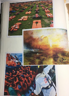
For my next print I decided on a figurative subject. Living in Southern Italy we are bombarded very frequently with images of migrants and refugees being rescued off the coast of Lampedusa from rickety boats and inflatable dinghies. My overriding visual impression from these images is the bright orange colour of their life jackets. That orange really is a symbol of their plight. And despite the bright colour we see these images so frequently that compassion fatigue means people have a tendency to stop seeing or to ignore. The figures are staggering - more than 5000 migrants drowned in the Mediterranean (1) in 2016 alone. In making the crossing from Libya to Italy the odds of dying on the journey are 1 in 47. (2)
I looked at photographic images of the crisis on the Internet and made some sketches. I also looked at art historical references. The image of a migrant arriving on the island of Lesbos lying back on a pile of the discarded life jackets and clutching a mobile phone in hand has some parallels with the tangle of bodies in 'The Raft of the Medusa' by Theodore Gericault, simply because his pose and orientation echo that of the figure in the lower left corner of the painting as well as the theme being peril on the sea.
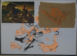 |
| Sketchbook page: Refugees |
 |
| Sketchbook page: Refugees |
I also looked at the work of Ai WeiWei on this - he used the life jacket as a symbol of refugees - he has coated the pillars of the Konsterhaus in Berlin with life jackets and also made an installation in the gardens at Westminster laying out the life jackets in a grid.
The other art historical reference which has resonance with this subject is Turner's 'The Slave Ship' of 1840. This painting depicts dead and dying slaves being thrown overboard from a ship as a storm approaches - an action which allowed the owners to claim on insurance for losses. The slaves were see as a commodity and property rather than as human beings. There are parallels today with the traffickers who take the money of people desperate to migrate but do not care about their safety. There are also traffickers who transport women or children to be sold into sexual slavery.
 |
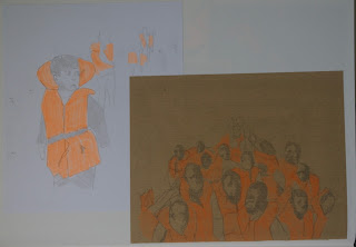
| Sketchbook page: Refugees |
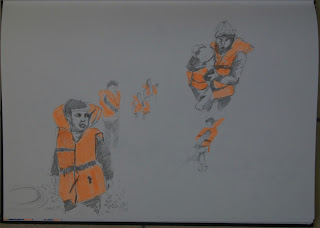
I went on to sketch images of women and children. My plan was to use negative masks to allow me to print the life-jackets in sonic orange and to use backdrawing or drypoint for details.
 |
| Sketchbook page: Refugees |
My first attempt was on textured Strathmore paper and used only the orange and black. The backdrawing wasn't particularly well aligned with the masks and my attempts to put texture into the image of the refugees on a beach was not successful.
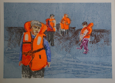
I tried again. This time I started with a drypoint drawing of the figures, I used positive masks over the figures and printed the background in Prussian blue which had been been passed through the press with textured wallpaper to add texture to the background. I then rolled the sonic orange onto the plate and wiped it off except in the areas of the life jackets. I encountered numerous problems. Despite taking great care with the alignment and registration I found that I was not able to accurately co-ordinate the drypoint and monoprint elements. I also, being new to drypoint hadn't really mastered the technique properly and the lines were not dark enough. I was disappointed with the results.
 |
A combination of drypoint, negative masking and
texture with subtractive monoprint |
On one of the prints it was really obvious that the plate had slipped dramatically from where I had placed it:
The others varied in their degree of offsetting and none of them were adequately aligned.
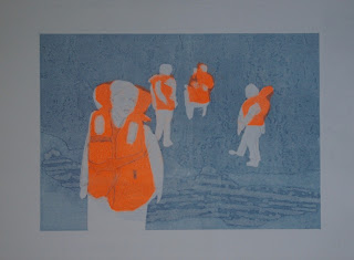
I eventually abandoned the drypoint and decided to go with backdrawing for the details instead. I printed the background using wallpaper textures as before and the subtractive technique for the life jackets. I worked into the figures and background by using backdrawing. I used oil pastels for this. I traced the basics of the image with permanent marker onto a sheet of OHP acetate. The oil pastel was applied to the back of the acetate and then I placed the acetate over the print and transferred the oil pastel using a sharp hard pencil. This technique allowed me to use multiple colours because I could use one colour and wipe it off the acetate before applying the next.
I did not put a lot of detail or additional texture in the background. I also made the decision not to put any shadows under the feet of the figures. I felt that this lack of detail, the blue-greyness of the background as well as the lack of shadows grounding the figures added to the sense of dislocation of the figures from their environment. They look lost and floating. Their environment does not look inviting or comfortable. In terms of the actual execution of the drawing, I am not that happy with it. I prefer the sketchiness of the distant figures to the execution of the figure in the foreground. Although I think his eyes capture the doleful expression I was looking for the nose and mouth got away from me. I also think I should have stuck with my first instincts and added less colour. Too much colour has detracted from the dark, dystopian image I was going for.
 |
| Combination monoprint: Texture, masking, subtractive and backdrawing |
My other problem with the above print is that it is just really a fairly literal interpretation of a photograph. I started to think of other ways in which I could use the symbol or colour of a life jacket to represent the refugee deaths. I thought about using the symbol of a flower following the tradition of still life as flowers being a symbol of mortality. Thousands of flowers in the fluorescent orange life jacket colour each one representing a refugee killed in the Mediterranean. Perhaps this was too much of a rip-off of the installation of poppies at the Tower of London.
I wondered whether it would be possible to tessellate simplified symbols of life jackets being gradually converted into flowers. I looked at the work of Escher and had a go at this in my sketchbook. It wasn't very exciting. Triangles or diamond shapes would create a more dynamic tessellation than the almost rectangular shape of the life jacket.
One of my recurring interests is in repetitive mark making. I find it a meditative and calming activity. I sometimes use doodling as a way to relax before going to bed to avoid the stimulation of social media and illuminated screens which tend to exacerbate insomnia.
I took a closer look at the work of Hilary Ellis a British artist whose work I first encountered at the Jerwood Drawing prize exhibition a couple of years ago. She had used repetitive mark making in stitch which speaks of the often futile repetitive actions of the work of women. I was attracted to the work even before I had read the artist's statement because the marks although very similar were inevitably slightly different because it is impossible to be completely precise and regular when working by hand. Repetitive mark making is something I would like to explore further.
I indulged my obsession by filling a page of my A3 sketchbook with very simplified stick figures each corresponding to a mark made with an orange highlighter pen to represent a life jacket. I though I could use this concept - finding out how many people actually died in the Mediterranean last year and making a very large print on a roll of Chinese paper using either masking or painting for the life jackets and backdrawing for the figures. I did realise that the figures looked almost like crucifixes from a distance which probably isn't appropriate for a population containing mainly Muslim people. I considered actually making the stick figures into numbers because that is how they are presented to us - as numbers and statistics rather than individual human beings.
The other possibility I briefly considered was using my cartoonish bees in life jacket orange and black instead of yellow and orange, recalling David Cameron's comments last year about migrants swarming into the UK.
Unfortunately, having already missed two deadlines and with another one approaching very quickly I realised I simply didn't have time to execute these ideas. If I ask for another extension there is a risk I will never complete this course. I have decided to submit the combination monoprint I have already produced despite the fact there is significant room for improvement here. It would be possible to go on forever without being sufficiently satisfied to submit my work - I need to stamp on my perfectionist tendencies here and move on. These Ideas will remain available for possible later development.
References
(1) https://www.theguardian.com/world/2016/dec/23/record-migrant-death-toll-two-boats-capsize-italy-un-refugee
(2)http://www.unhcr.org/uk/news/latest/2016/10/580f3e684/mediterranean-death-toll-soars-2016-deadliest-year.html


