Tuesday 31 July 2018

Assignment 3: Reflection

In terms of overall performance against the level 4 HE requirements, this assignment is probably at a level D or E as follows:


  • adequate development of visual and technical skills, design and composition. D
I can see some progress in the development of my technical skills from assignment 2 although I am still having some issues with excessive ink which causes prolonged drying times and I still am not consistently accurate with registration
  • Adequate realisation of ideas and satisfactory presentation of work D
Despite some problems with inky fingers in the margins of my work (I am trying to get into the habit of using 'paper fingers' made from scraps of paper to handle the paper. My work is generally adequately presented for this stage of the course
  • Reasonable development of analytical and creative thinking, showing some independent judgements. Personal voice not evident. D
I still need to work on pushing this aspect of my work further - in this assignment my work has been rather illustrative and figurative - I may push back more towards the abstract organic forms I was looking at on the next assignment. I'm still not sure which way to go or whether my two areas of interest will converge before I get to my final assignment. 
  • Awareness of a satisfactory breadth of contexts and debates supporting your growing personal and/or professional knowledge and understanding D
I have done more research on animals in visual culture and also on 'the mind as matter' - that is the materiality of our selves than is currently evident from this blog. I have been making notes as I go along but they are not yet complete - once I am happy with the summary/evaluation of the texts I have read I will post these review on my blog (before the next assignment)


Monday 30 July 2018

Assignment 3 : Submission

Task 1 (project 8)


Critical Statement

Task 1 (Project 8)

I chose the subject of a panting and fearful pug because I wanted to say something about the suffering of these animals which has been caused by selective breeding for certain characteristics which people find appealing. Their flat faces and small noses in particular, cause breathing problems. 

My colour choices were bright in order to reflect a pop art aesthetic because these dogs are fashionable commercial products. I selected shades of blue and purple because I wanted to reflect the colours of cyanosis when the skin and tongue take on a bluish tinge because of lack of oxygen. 

I used a cropped composition, which doesn’t include the whole face of the dog. My aim with this was to not allow any breathing space around the subject and to give a feeling of claustrophobia.

The final prints are successful in some aspects. The registration and the transfer of ink is good so technically I think the execution is acceptable. The main fault with the execution is the failure to adequately clear the lino in non printing areas. Because I have been consistent in the direction of my clearing marks I don’t think it’s a major problem I the background area on the left side of the print. In fact, I quite like these marks. However, in the upper right corner, these marks overlie the subject and I thick that these marks detract from the print. 

The colour choices I made were not ideal because I don’t think that there is sufficient tonal difference between the second and third colours. 

Overall I don’t think this communicates my concept quite clearly enough. My vet colleagues get the point when shown the image along with the title. However, the image on its own could just be pretty picture of a pug which has been poorly composed and printed in nice bright colours. To communicate a negative concept it may be necessary to make the imagery more grotesque but then it may become too obvious. It is difficult to find a balance. 


Task 2 (project 9)


Critical Statement

Task 2 (Project 9)

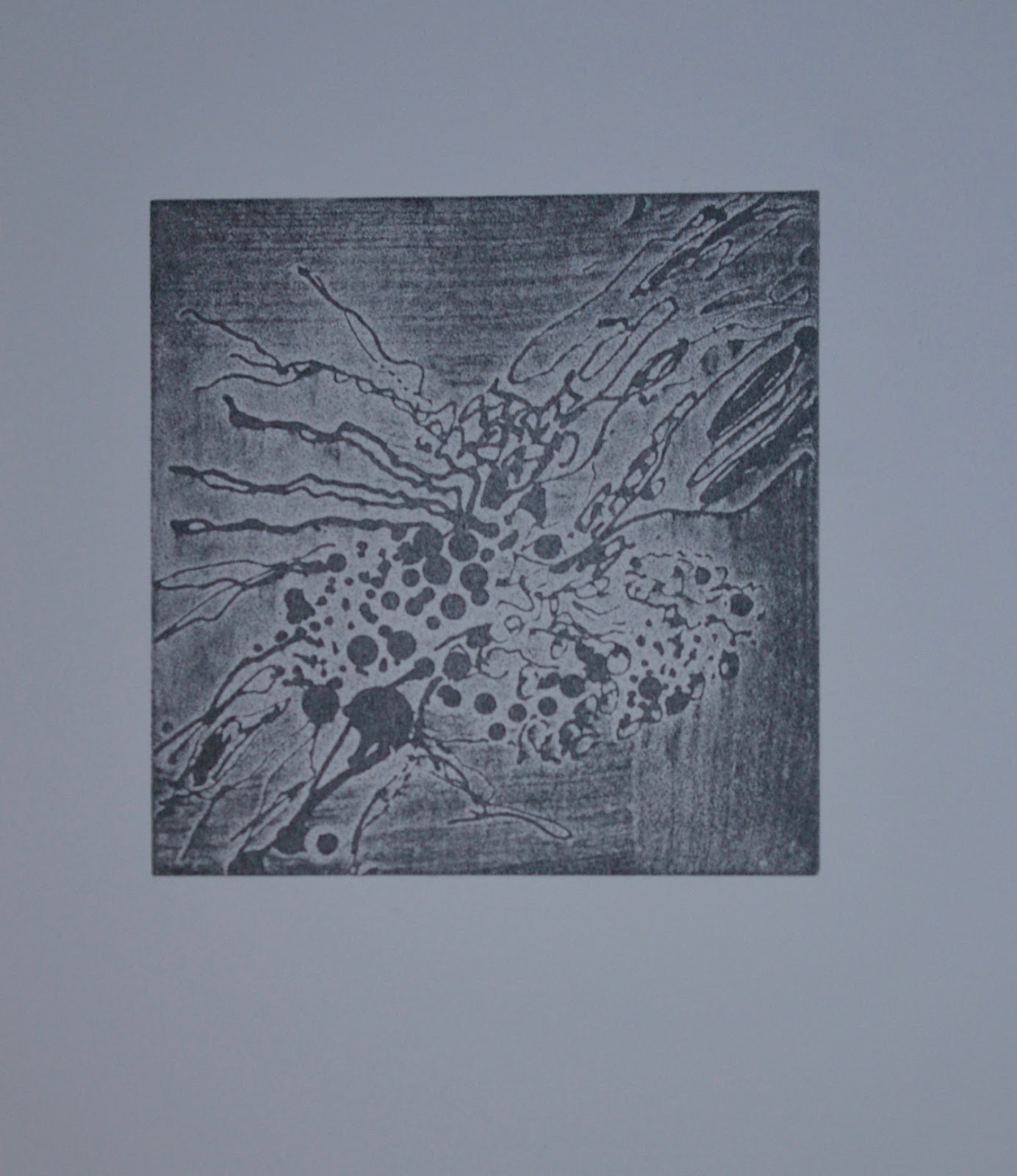
Prints are presented which contain marks made in various experimental ways on the lino. 

Marks have been made using a pocket-knife, screws, nails, a wire cutter, a cheese grater and a lemon zester. On a separate plate, a variety of marks have been made using a dremel with various heads and drill bets. 

Further experiments in mark making consist of lino etched after the application of wax and lino etched multiple times. Some of these have been overprinted on top of each other in multiple colours.


Task 3 (project 10)


Critical Statement

Task 3 (Project 10)

I have produced two different prints for this part. The first ‘fur baby’ is a type of chimera combining human and canine features. This is informed by an extreme type of anthropomorphism which leads people to select ‘designer’ pets which share certain physical features with human babies making them appealing on a basic evolutionary level and securing their place as a child substitute in many modern households. However, natural evolution has little to do with the occurrence of these animals because they are selectively bred by humans for traits which in the natural world would constitute a distinct disadvantage to their survival. 

I selected bright colours because I wanted to reference pop art as this is a comment on commercialisation and commodification of animals. I used a combination of techniques with reduction cutting on the coloured block and lino etching on the ‘key’ block. I pulled the prints by hand burnishing. Considering this, I think the transfer of ink is adequate. There are however, some technical issues, in particular with the registration.

I wanted to reading of this print to be somewhat ambiguous because the issue is a complex one and not black and white. These animals are cute and they are mainly well cared for as a result of the anthropomorphic way in which their owners relate to them. However, I strongly disagree with the breeding practices, which have brought about their existence and the acquisition of them by people who want them because they are the latest ‘must-have’ fashion accessory. I think this is partially successful because people who I have showed it to have described it as disconcerting. It is both ugly and cute. There is an attraction and revulsion. The image is grotesque but not to the extreme of ugliness.

The second print is of a rooster. Although I have many ideas about chickens and their place in society, which I would like to explore more fully, this particular print was inspired mainly from a photographic source in which I was fascinated by the texture of the comb and wattles. My main aim was to try to reproduce the texture and to attempt to convey the somewhat challenging or menacing look in this rooster’s eye – although this is indulging in blatant anthropomorphism. 

The texture has been achieved using lino etching and a resist. I think this is successful. I also like the mark making I have achieved on the second plate with various tools. However, there are some technical issues with the print. I selected complementary red and green because I thought it would add to the impact of the print but I think that perhaps their tonal values are too similar which reduces the tonal variation and therefore the impact of the final print.  There are also problems with registration again. 

Overall I think I have fulfilled the requirements of the tasks but there are lots of areas which could be improved. 


Sunday 29 July 2018

Project 10: Experimental Relief Prints (Part 2 - Rooster)

I have recently become interested in chickens. This came about through a startling image which presented itself to be when walking past my neighbour's garage one day. My neighbours have a smallholding on which they raise chickens. That day had obviously been chicken slaughter day as the bench in the garage was crowded with plucked chickens with their feet pointing into the air. I find there is something tragicomic about this image. It is somewhat ambiguous. On the one hand there is the temptation to turn away from death and on the other to laugh because the feet pointing in the air are slightly comical in the way the completely remove any dignity that the living animal may have had.


This set of a whole train of thought about production animals but in particular, chickens. The chickens in this image had relatively good life in comparison to those which are intensively farmed.
As a veterinary student I had to go to various intensive chicken farms. We visited battery hen units and witnessed the appalling conditions in which the animals were kept as well as the mass slaughter of all the day old male chicks which are no good for egg production. (They are often killed by being thrown alive into a meat grinder or suffocated n plastic bags). 

We visited farms on which chickens are intensively raised for meat. They are raised in extremely overcrowded conditions walking on their own waste in a shed which stinks of ammonia so that your eyes stream when you go into it. Overcrowding makes them very stressed. We had to be very quiet as a sudden noise can initiate panic in which many birds can be injured. Many of them have broken legs by the time they are slaughtered because they are bred and fed for rapid weight gain and they outgrow the strength of their bones. 

We also visited the Marshall's Chunky Chicken Factory. This is a massive mechanised slaughter house. The live chickens are attached by their feet to hooks with their heads dangling down and go on a nightmarish mechanised roller-coaster ride to come out as supermarket cuts of chicken at the other end. There are first supposed to be stunned when their heads pass through an electrified bath of water  many of the chickens aren't stunned because they lift their heads away from the water. The next machine lets their throats (some also evade this). Then they go into a scalding hot water tank where rubber 'fingers' pluck out their feather. (The ones which evaded the knife die here) This tank is a slurry of faeces and feathers. On the other side the pass down the line and people eviscerate each chicken as it passes by. After experiencing all of this is it any wonder became a vegetarian and then a vegan!

However, if you ask people in general for their image of a chicken they will talks about cocks, hens and chicks scratching around in the farmyard. This image bears no relation to the way in which most chickens are farmed. Advertisers and supermarkets exploit these romantic association and most people either don't question, choose to ignore or are blissfully unaware of these facts. 

The chicken's place in society is an interesting one. In the past they were revered in many cultures. Even today, the cock is seen as a potent symbol of masculinity as well as a natural alarm clock signalling the new day. The hen protecting her chicks is like the ultimate symbol of maternal love and protection. Eggs and chicks are used as symbols of rebirth, renewal and springtime. However, they are also probably also the most exploited and badly treated animals on the planet. Why is it considered normal to exert such cruelty on this species while there would be a huge outcry if we did the same procedures to puppy and kittens? This speaks of our natural tendency to categorise and classify elements of the natural world for our own convenience. 

Even among chickens there are subcategories. There are fancy chickens and rare breeds which are primped and beautified to be shown as status symbols. There are urban chickens living in plastic Eglus all over London. There are pet chickens. There are still some farmyard chickens on smallholdings and then there are the vast majority of chickens which are the production animals previously described. 

I have not yet attempted to address any of the above in my work. I have started with simple representation. While looking at images of chickens I became fascinated in particular by the texture of the comb and wattles of cockerels so I thought about ways I could achieve this and thought that etched Lino would be ideal for this granular texture. 

I have made a print using two plates - one is a reduction plate which includes the etching. This plate was used for the eyes, comb and wattles. The second plate had the details of the beak and feathers. I used a photographic reference for this print. 

The first layer of the reduction was printed in pale grey with a few highlights cut away. Layer two was a dark red for the base colour of comb, wattles, earlobes and the eye area.


The next step was to apply watercolour resist medium in the pattern of the textured parts of the comb and wattles and then to etch with caustic soda. This etched Lino was printed in a pale pink (which actually appears more grey against the dark red)


I was quite pleased with the way the texture appeared. I then went on to carve the second block and do a test print on that. I chose to print the second block in green to create a complementary colour scheme. 


Layer 4 of the print ( the final layer) was plate 2 in green. 


The registration isn't perfect which meant that I lost the highlight on the eye and I think this detracts from the character of the subject. I like the textural effect but I'm not sure about the colours. The red and the green are quite close in tonal value. They make a nice dark where they overlap but I haven't really exploited this fully. I think some more carving of the beak would have helped by giving a lighter point. I have some of the red/grey prints left so I might try printing plate 2 in another colour to see what difference it makes. However, at this point I have run out of time and must submit my work. 

What I learnt

  • I am managing to align two plate prints better at this stage although registration is still not perfect
  • Lino etching can be used as a stage of a reduction print
  • Lino etching ca be useful for creating textures

Points to consider for next time

  • Try out colour schemes - perhaps using collage in the sketchbook - even if time is short this may save time and wasted effort in the long run
  • This is an entirely illustrative and figurative work - try to develop the concept of the work further next time. 


Friday 20 July 2018

Project 10: Experimental relief prints (Part 1 - "Fur Babies")

My starting point for this project was the work I had been doing in my sketchbook related to 'fur babies' . These sketches were my reaction to a phenomenon I encountered frequently in my work as a veterinary surgeon. Pets, and especially dogs have been around us and part of our culture for so long that it seems natural that they would live in our houses with us. Our way of relating to them is blatantly anthropomorphic. That is we imbue their behaviours with underlying human emotions and motivations. This means that dogs exist somewhere in a hinterland between being an animal and being human. Many dogs live an extremely privileged life compared, for example to production animals such as chickens.


Sketchbook Pages: Fur Baby


Most of my clients treated their dogs as members of their family and many of them referred to themselves as 'mum' and 'dad' when talking to their animals. The animals were referred to as their 'fur babies'. Indeed, some clients would take greater care with their animals' health than with their own! In some relationships this fulfilled a need in those who were yearning to have children but were unable to - the pet then became a child substitute. In other cases the pet was not a child substitute but an alternative outlet for affection or existed alongside other children in the family at only a marginally lower status than them. 

There are advantages and disadvantages to this 'fur baby' status for the dog. It is lavished with affection and its needs in terms of nutrition and health care are catered for. However, behavioural problems can arise as a result of the dog being treated like a baby rather than being allowed to express its normal dog behaviour. Roaming freely and rolling in the smelliest substance to be found as well as territory marking with urine at the margins of the home range are not acceptable behaviour in a human household. Being confined for 90% of the day indoors can lead to frustration and aggression. I have been forced to euthanise many dogs over the years because they have bitten people - this is largely the result of misunderstanding of the dog's behavioural needs and signals by people. 

One of the worrying developments in recent years is the fashion for brachycephalic (flat faced) breeds such as pugs and French bulldogs. These dogs are now more like fashion accessories. Their 'fur baby' status is reinforced and they are considered 'cute' because they stimulate our primeval drive to care for human babies. They share some physical characteristics with human babies, namely: widely spaced and large eyes, rounded faces, chubby little bodies, small noses. However, there is a major downside for these animals . The very characteristics which people find so appealing can cause severe health problems. 
Small nostrils along with excess tissue at the back of the throat and narrow airways can cause severe breathing difficulties - especially if the dog is chubby. Those large eyes are prominent and often get ulcers. Short stubby legs and rounded bodies can come along with skeletal deformities. The big round face necessitates a large head relative to the size of the body. This means that a large number of these breeds cannot give birth by themselves. I have lost count of the number of French bulldog and pug caesareans I have carried out in the wee small hours of the morning. I find it abhorrent that these animals exist in such large numbers only because they are delivered by caesarean. The fact that these dog breeds are fashionable contributes further to welfare issue with the rise of puppy farms in which bitches are kept in inhumane conditions just to produce litter after litter of pups to satisfy public demand. The dog has, in this case jumped from one of our cultural 'pigeon-holes' to another i.e. from pet to production animal. 


Sketchbook work: Pugs overbred and gasping


One of the reasons that I no longer practise as a vet in an emergency clinic is the fact that I was in a situation which forced me to act contrary to my own personal ethics. I disagree with brachycephalic bitches undergoing multiple caesareans during their lifetimes to provide profit for dog breeders. However, when presented with a bitch that is struggling with her labour, I cannot refuse to carry out a caesarean because that would lead to the suffering and death of that individual. This situation was becoming more and more common in my everyday practise (although the reasons I stopped are more complex that this - it was a contributory factor).

However, I still have some ambivalence about these 'fur babies'. I am human, so I am not immune to their 'ugly-cute' appeal. I have met a lot of pugs and Frenchies over the years that had happy and engaging personalities despite their health problems (I too indulge in anthropomorphism). The people who have these dogs generally love them dearly and care for them to the best of their ability so I cannot outright condemn them. I wanted my work to reflect this ambiguity. To be unsettling or disturbing while also being attractive and interesting to the viewer. 

Of the sketches of fur babies I had made, the one which made both my husband and son give response of being perturbed/unsettled was this one:


I enlarged it in to my large sketchbook and then traced it onto a piece of lino. 

Because the subject to me was quite a dark one, I felt that the grainy darkness of etched lino would be ideal for this. I decided that I wanted to work larger than I had previously. The largest size plate I had was approximately A3 so I went with that as I am trying to use up my current supplies before buying anything new. 

Before etching, I cut away a few areas which I wanted to remain white on the print. These corresponded to the red areas on the sketch (for violence), which I planned to print using a second plate. 
The white areas were carved away first
before applying the resist and the etch.


I decided to try to resist the etch in the areas I wanted to print black using wax. I melted the wax in a bowl perched in a small amount of water in my slow cooker - this meant that I could keep the wax melted without risking burning it, and because the wax didn't touch the slow cooker I had only sacrificed a bowl and the slow cooker lived to cook another day! This arrangement worked well for melting the wax. However, drawing with the taunting tool was more difficult than I had thought. It took me quite some time to create the rather wobbly design of the face. 

Once I was happy with the resist, I painted the caustic paste liberally over the whole surface of the plate. It started to turn brown almost immediately. I was worried that I might have made the paste too strong so I decided to etch for only ten minutes. This was a mistake. when I washed the paste off, it was clear that the etch wasn't very deep. Unfortunately scrubbing the plate had also removed most of the wax so I couldn't etch it again straight away. I removed the the wax residue by ironing and printed the plate. It was possible to make out some lines but the image of the face was lost in a mass of confusing texture. I needed to try again. 

Because the wax had taken so long, I tried a different resist this time. I had heard that copydex glue could be used. I had some watercolour resist medium in my cupboard which looks and smells very much like copydex and dis to a shiny, rubbery finish so I decided to give that a try. This was easier to apply than the wax and it worked very well as a resist. This time I etched the plate for 30 minutes. I had to hand burnish the prints because the plate was too large to fit in my press so I only used thin cartridge paper and Japanese and Chinese rice papers for this project - as well as proofing onto newsprint. 

(NB throughout this post the prints do not appear to be rectangular - this is due to the photographs being taken with the camera at a slight angle to the picture plane - it is a photography problem not a problem with the prints)


Test print taken from the plate after etching for 30 mins
and removing the resist (cartridge paper)

I was happy with the result of the etching here but I realised that I'd made an error with the design. This was just a head floating in space plonked in the middle of the paper. I decided to try to introduce more design elements using a second plate. This would also test whether I had overcome the problems with aligning two plates that I had encountered in part 2. I therefore decided this would be my 'key block' and I reversed this image into another A3 plate by printing onto tracing paper and then transferring the ink from the tracing paper to the second block. 

The second block would be used for printing the colours of the face and to give the fur baby some shoulders. I also decided to use very bright colours following on from my tutor's comment that mu previous two plate print was reminiscent of Warhol. I thought that a pop art theme would be coherent with the fact that I was making a comment about consumerism and the latest 'must have' fashionable item. I used Hawthorn's sonic lipstick pink which is almost fluorescent, and I added a lot of transparent ink/extender so that the colour would be more translucent, allowing the white of the paper to shine through. 


For the next layer, I used a dabber to apply French blue ink mixed with a large amount of extender to one side of the plate, I tried the inks on various types of paper and at varying thicknesses. Some of the prints I took onto the thin Chinese paper were ghost prints and they came out quite well despite the fact tag I was printing them by hand. 


Next, I carved away most of the lino on the face, leaving only the small areas which I wanted to print in red around the eyes nose and ears. I did not carve away the background but covered it with parcel tape while inking up, which I removed before printing. 


I then printed the background in a dark purple to give more tonal variation.


The absent eyes on this version give the print a mask-like quality which I find quite sinister. 

Finally, I printed the etched plate over this reduction linocut. The results were variable partly because I'd experimented with different inking on the reduction block and partly because I'd used different types of paper. 
Where the colour on the reduction block was too strong, it overpowered the details on the etched block:

Unsuccessful print: The sonic pink
overpowers the overprinted etched key block


On some of the less absorbent papers such as the newsprint and cartridge paper, the ink took a very long time to dry. It was still slightly tacky when I tried to overprint. The tacky ink took u excessive amounts of ink from the etched areas and the final image was almost shaded into oblivion by too much black ink:

Unsuccessful print resulting from overprinting
on ink that was still tacky - too much black
ink has transferred

The most successful prints were those which were printed on Chinese or Japanese paper. The thinness of these papers facilitated the burnishing. They are also quite absorbent, they take the ink well and this means that the ink also dries quickly. These prints were, however, far from perfect because I had some issues with registration. I was using Ternes- Burton registration pins. Unfortunately, because of the current heat and humidity, the masking tape I had used to attach the tabs to the back of the paper kept falling off. In future I will allow extra paper at the top of the print which I can trim after printing, enabling me to use something stickier like parcel tape or super glue without fear of tearing the paper on removal. 


I also printed a few of a simpler version of this print using just the black and the red around the eyes. If I ignore the fact that this is a floating head, I actually prefer this version of the print. I like the fact that the grainy texture of the etched Lino is more evident and the subtle hint of violence with the use of red. Often less is more. Overcomplicating things doesn't necessarily make them better but it does increase the potential for error. 


What I learnt

  • It is possible to combine lino etching and cutting on a two plate print
  • Overcomplicating things make the process arduous and doesn't necessarily translate into better results
  • It is possible to pull clear prints by hand burnishing on large plates and thinner papers which attract the ink (such as Chinese and Japanese rice or Kozo papers) give the best results.
  • Printing over tacky ink will result in greater transfer of ink

Things to try for next time

  • Be patient and wait for the ink to be completely dry before overprinting
  • Try a different technique for affixing the registration tabs to the paper - it is almost impossible to achieve accurate registration if the tabs fall off
  • Try printing the etched plate using an intaglio technique using a press. 


Wednesday 18 July 2018

Research Point: Contemporary printmakers who use experimental methods in their printmaking

Research point


Take a look at some contemporary printmakers who use experimental methods to make their prints. You could start by exploring the printmakerscouncil.com website, where you will find links to some interesting practitioners. What have you found of interest? What new techniques and ideas have arisen in this investigation? Make notes in your learning log.

First a disclaimer because found this research point quite difficult. The reason for this is that I am relatively new to printmaking so all printmaking techniques are new to me. This means that I found it quite difficult to identify which printmakers were using experimental techniques. However, I have become very interested in lino etching after the course which I attended, so I decided to look mainly at artists who employed this technique. To me this seems like and experimental technique but it may now be accepted as mainstream.  


Fabian Matthias Osborne


Fabian was one of the tutors on the lino etching weekend course which I attended at West Yorkshire Print Workshop. 

Originally a ceramicist, his printmaking has developed from the same thread of subject matter which came through in his ceramics. He explores the surface textures and patterns that he finds in the landscape, both in the urban environment and in nature. 

His current work uses lino etching entirely and he generally works on large circular plates which he cuts by hand with a craft knife (quite a feat in itself in my opinion!). This must also make registration when printing in multiple layers a real challenge. On the course, he seemed to be able to do it using a simple registration sheet by eye - but as I said not having a corner to register to may make this more difficult than he made it appear. 

He creates patterns and textures using a variety of techniques with the etching. For example his 'Emerald Moon' employs marbling with stop out varnish and repeated etching. 'Spacers' employs letterpress spacers dipped in stout varnish and applied to the plate in a pattern and 'Pool' and 'pools' employ the technique which I tried out on the course which involves repeated etching in ever decreasing areas concentrically. 

He prints in multiple layers and will rotate the plate slightly on each subsequent layer to enhance the irregularity of the patterns created (although again, it must be a challenge to know whether he has rotated it because of the lack of points of reference on the circumference of a circle. 

I found his work inspiring and it made me want to experiment further with lino etching. 


Jenny Thomas

Jenny also tutored on the lino etching weekend but she allowed Fabian to take the lead in the demonstrations. During the weekend she carried out many experiments with different ways of creating a resist. Her willingness to experiment and 'play' was contagious and I found her approach liberating. 


The image in the link above "Flower 7 - stripey" is created using lino etching. It is on a square format and I suspect it has been etched more than once. It is printed in two colours read and black. The gestural nature of the abstract flower petals give it a dynamic feeling. The texture is very interesting. Brush marks are exploited from where the etch has been applied and the parallel stripes have been made by dragging a metal decorators' comb across the lino during the etch to manipulate the placement of the paste and to scratch the softened surface of the lino. 

Steve Edwards 


This artist is probably best known for his large scale cityscapes and landscapes. In particular he manages to evoke the atmosphere of the urban landscape of London and light reflections from the surface of the Thames. exploits the lino to its full potential using a combination of etching and cutting. He sometimes also combines this with monotype. As well as the landscapes he does look at other subjects including figurative (human) subjects. 

Looking at some of his London cityscapes from a distance, they look almost photographic in their realism. He captures the quality of light and the shapes of the London skyline beautifully. Looking in more detail however, you can see the complexity of the textures that he has managed to create on the surface of the Lino. 

He uses the textural elements from the etched Lino to represent the more natural parts of the urban environment such as the water and clouds. The cut elements are more controlled and therefore more suitable for the silhouettes of buildings. I think he uses a variety of techniques to ink his plates too such as rainbow rolling and selective inking of certain areas such that he may in some cases be creating variable editions. 

I would love to see this work in person as many of his prints are large (for example 70x90cm) and so it is no possible to perceive the full impact of the pieces from small photographs - I'd like to get right up close and try to work out exactly how he has achieved such textures and light effects. Maybe he is using a combination of relief and intaglio printing techniques which would add an additional layer of technical difficulty with having to dampen the paper and deal with expansion and shrinkage in multiple layered printing. I don't know. 


Alison Pilkington


Pilkington is an Irish artist and is both a painter and a printmaker. she has really made Lino etching her own. Her works are abstract and are all about texture and colour. I again would like to see her work in person to try to work out how she has gone about creating these because the although they appear simple I suspect they are actually quite difficult to create. She manages to leave areas of crisp bright colours as well as the more granular textured areas of the etching - is she using cutting as well as etching? Does she use multiple plates or multiple layers of etching on one plate like a reduction? 

However she manages to achieve these exuberant prints, her work is very different in character from the other artists I have mentioned in this context - this shows that Lino etching is a versatile technique that can be used to achieve a variety of effects on the final print. 


Anthony Broad

Does not use Lino etching but I have never seen the technique he uses before so I have included him here under experimental techniques. 


Although the theme of this artist's work doesn't particularly chime with my own concerns, being about masculinity and concepts of manliness in society I was intrigued by the metallic surface he manages to create on his prints. 

On his website, Broad states that this is his own technique which he has recently developed. He applies graphite powder to the paper which he burnishes to a smooth finish. He then uses blind embossing with a woodcut block. This makes his final works almost sculptural although they are created on a flat sheet of paper. The paper appears transformed into something more substantial and perhaps more valuable - sheet metal, armour or coins. 


Monday 16 July 2018

Experimental mark making on lino (Part 2 : Etching)

A while ago, I attended a weekend course about lino etching at West Yorkshire Print Workshop. It was run by Jenny Thomas and Fabian Osborne who were wonderfully informative and really encouraged our creativity. I thoroughly enjoyed this course so am including notes and photographs here because it is relevant to the current area of study. 

The Lino is etched using a combination of water, caustic soda crystals and wallpaper paste. The wallpaper paste adds body to the etching mixture so that it stays where you put it. 

It is very important to wear protective clothing, gloves and eye protection when doing this because the caustic soda will eat anything organic including human tissues. Also, when mixing up the paste be prepared for the fact that the chemical reaction generates heat. The paste can be stored in a sealed glass jar for up to 4 weeks - it is at its strongest when first fixed but gradually loses its effectiveness with time. 

The caustic mixture can be painted onto the lino using a synthetic paintbrush Natural hair brushes will be destroyed by the caustic soda). How deeply the plate is etched depends on how thickly you apply the paste and how long you leave it on for.  The paste can be manipulated on the block using tools or cardboard to create designs. 

The other way to create designs is to use various substances as a resist. For example wax, electrical tape, copydex glue, or stop out varnish for traditional etching. 

I tried out several of the different ways of resisting the etch and drew quite freely on the lino plates with my chosen resist but loosely basing my designs on some of the organic shapes I'd been looking at in my small sketchbook: bacterial cultures, chordae tendinae of the heart and so on. After applying the resist and waiting for it to dry I applied a thick layer of the etching paste. As the paste etches the lino it turns from grey to brown. It usually takes about 10-15 minutes to take effects but can be left longer for a deeper etch. 

When the plate was sufficiently eaten I washed the paste off with water and a nail brush and then poured vinegar over it to neutralise the NaOH (caustic soda). 


Print from lino etched after applying a resist of melted wax using a
tjanting tool for batik


I especially enjoyed playing with the melted wax. I dripped wax onto the plate in an attempt to recall the images of bacterial colonies I had drawn in my sketchbook. I also tried drawing with the tjanting tool. The drawing was very imprecise but great fun. The wax was allowed to set solid before etching. after etching most of the wax was scraped off and then the residue was removed by ironing the plate under multiple layers of newsprint. As well as showing the design, the brush marks from the application of the paste can clearly be seen in the resulting print. 

I decided to also try a type of subtractive method with the wax. This time I painted a thick layer of wax over the plate. When this had solidified I used various tools and a scalpel to remove areas of the wax. This allowed the etch to occur only in those areas where I had removed the wax.  Some buts of wax chipped off where I had not intended but this didn't really matter because it was a completely abstract experiment. 

Print from lino etched after cutting away wax
which had been applied widely to the surface
Another way to create an interesting image , this time without any resist, is to etch the Lino multiple times in succession. Each time the etch is repeated, it becomes progressively deeper and therefore progressively lighter on the final print. In the print shown below, I have applied the etching paste to progressively smaller areas with each successive etch achieving this concentric tonal gradation. I really like this effect, it gives an illusion of three dimensions and reminds me of contour maps. It could also be exploited for tonal gradation by etching deeper in areas which are to remain lighter and less so in darker tonal areas - this would be worth experimenting with. This particular image is reminiscent of fungal cultures.

Print from lino repeatedly etched in progressively
decreasing areas

In the print below I painted stop-out varnish onto the plate as a resist in an abstract pattern inspired by mu work on the chord tendinae of the heart. While the etch was proceeding I also scratched into the surface of the etching lino using various tools. This is overprinted on a coloured background I found this one of the less successful images but it was useful for learning this technique.


Resist created using stop out varnish. texture in the etched area created
by scraping with tools during the etching. Overprinted on a coloured
background

The other technique we tried, was marbling. This involved floating stop out varnish on the surface of water (with a little wallpaper paste). Breaking up the surface tension to make the varnish break up into interesting shapes and then applying the lino plate to the surface of the water. This meant the varnish would stick to the plate. Some amazing results came from this although my pate was a little disappointing as the drops of varnish were quite small so they just gave a grainy texture to the surface as seen in the sketchbook page on the left hand side below. 


Left side: print from lino etched after applying stop out by a marbling
technique. Right side: lino etched after applying melted wax using a
tjanting tool

After preparing and proofing our plates, we experimented in printing multiple layers. We used inks that were not completely opaque in primary colours in order to allow some colour mixing and overlaying of patterns to show. Some of the results were great. The only drawback was that the lino blocks were not cut completely precisely to size so some of mine were slightly off being square. I did the best I could to align them but as you can see there are quite a lot of issues with the registration. If I were to want to display these it would be necessary to window mount them with mat board to conceal the edges.


What I learnt:

  • Lino etching can be employed with a variety of resists which each give individual character to the marks made
  • repeated etching on the same plate can create gradations of tone
  • How to mix up caustic soda paste and how to use it and neutralise it
  • Health and safety procedures for working with caustic paste
  • If you plan to print in multiple layers always make sure that your plates are precisely the same size and shape before you start.