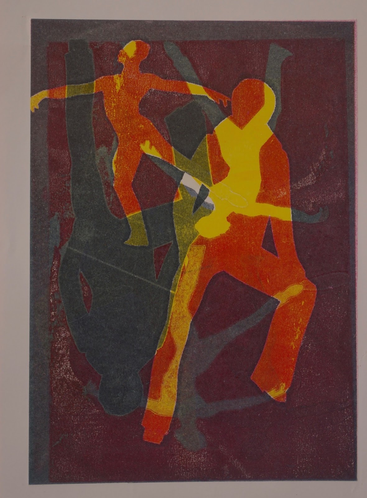
I recently visited and Exhibition at West Yorkshire Print Workshop by Alan Birch called 'Later day Saints'. Click here to view some of the saints he has created on his own website.
He was inspired by wood carvings of saints at the Wellcome Collection at the Science Museum in London.
He has used references from books and religious paintings and sculptures to create a collection of contemporary saints. These saints make reference to modern day objects or activities to which people are devoted or which are worshipped by everyday people. Superstition is still alive and well today and people probably would pray to Saint Lotto if they though this would help them to come into money.
The artist has created over 90 monoprints from which he selected 52 to become etchings and hand coloured drypoints.
The overall concept is interesting although I must admit I have seen something similar before in which modern day celebrities such as Simon Cowell became saints in the paintings of a fellow OCA student Adrian Eaton.
However, the prints themselves didn't really excite me - there were so many of them all of the same size and apparently rapidly executed. They all seemed to merge into one to me - maybe that's partly the point - a comment on the crass mass production of today's society and the fact that we worship false idols sold to us via the mass media.
Birch has certainly been astute in identifying symbols of modern culture. Many of his saints evoked a wry smile of recognition from me for example Saint Saleus if Primark, Saint Selfie-Stick and Saint Duvet. The one I identified with the most was Saint Remain - the modern day British Saint Sebastian who is pierced by the nationalistic Union Jack arrows of the Brexiteers. Oh dear :-(
Friday, 24 March 2017
Bottle Jack Press
In preparation for the relief printing section of the course I have acquire a 'bottle jack press'.
I had been looking at resources on the internet for printmaking. I really would love to have a decent sized etching press in my studio at home but the cost of something like that is prohibitive. While I was searching online I came across the design for a relief press which uses a car jack to apply pressure. The design by Charles G. Morgan can be accessed on the website monoprints.com by clicking here
I showed the design to my husband Luigi. To my surprise he was enthusiastic about making one. I think that may have been partly motivated by the suspicion that I might decide to buy a press instead. However he does regularly like to inform me that he is a 'trained technician who doesn't need to read the instructions' (!) He also decided he could improve on the design by making the frame in steel and welding it together. Below are photographs of the work in progress:


And here is the completed press positioned in my studio:

The total cost of the materials to build this came to about £200 - however I suspect it would be even cheaper using the materials from the original design plan - steel is a more expensive material - the springs were a bargain though! Our neighbour gave them to us - they're shock absorber springs - not sure if they are from his old car or his old tractor - they work well to push the platen back up when the pressure is released.
I am feeling very fortunate to have such an indulgent and practically skilled husband - I can't wait to get started on Part 2 of the course to try it out.
Thursday, 23 March 2017
Drypoint Workshop at Artison in Masham
I recently attended a one day drypoint workshop taught by Hester Cox at Artison in Masham. Hester was a great teacher - her explanations were clear and in depth and she was patient and encouraging to all of us - most of us were complete beginners with the technique.
I had chosen to try out drypoint because I enjoy drawing and this technique seems to be a way of incorporating lots of ways of mark making into my work.
Hester provided us with a resource sheet describing the technique and also with lots of reference material - examples of works in drypoint and also drypoint with chine collé were spread around the benches at the side of the room and she also provided links to the websites of numerous artists working in drypoint:

Of the artists listed, I have selected a few whose work particularly interests me:
I love the simplicity of Farmer's drypoint prints. The quality of the line is delicious and flowing like that obtained with rapid continuous line drawing. Some of her designs are quite minimal such as her three finches - she has simplified the forms in a very satisfying way - excluding extraneous details. Others such as her coot (which is actually an etching rather than a drypoint) cotton multiple vigorous lines to suggest the form. Wonderful.
This artist's use of drypoint is much finer - some of his drawings resemble botanical or scientific drawings. Many of his drypoints feature a single tree or plant surrounded by open and almost featureless space. These make me feel slightly melancholy as they seem to speak of solitude or loneliness.
Kihlman uses many different printing modalities in his work including drypoint. His drypoints are very heavily worked which is contrast to the two other artists above. In many of his works the mark making covers almost the whole of the plate - he creates a dark atmosphere in which patches of light stand out dramatically. Reflections of the sky on the surface of puddles against a dark pavement are particularly evocative. The dramatic difference between the work of these three artists shows the versatility of this medium - there is a lot to learn and try here.
Mary Cassatt
Cassatt was a American Artist who worked in France through most of her adult life and exhibited along with the impressionists. Like the other impressionists, many of her works depict people going about their everyday activities - capturing a moment in time. Her work is special because it mainly depicts women doing everyday things such as caring for children or hanging out the washing: Subjects which would not have been considered suitable for 'high art' before this period. Her drypoints are charming and are a suitable medium for conveying the fleeting nature of the moments she captured with the energy contained in its lines.
Olivia Lomenech Gill
I have included Gill here because I admire the energy of her linework - particularly in her depiction of animals. I also find her use of Chine collé interesting - she has used pages from books as well as brown paper - this gives me more ideas.
Catherine McDonald's work has a satisfying velvety inky blackness about it which I really love. Her silhouetted landscapes with telegraph poles have an air of mystery and again isolation about them.

Hester first gave a us each a small piece of drypoint plastic to experiment on and try to make as many types of mark as possible. I thoroughly enjoyed this. I mainly used the drypoint needle provided but also had a try at using a roulette and a diamond tipped needle which gave texture and a different quality of line - the diamond tipped needle was easier to mark the plate with - especially for curved lines.

The subject matter for the day was to be birds. I had brought some photographs with me for inspiration. I decided to use a photograph of a juvenile black heron having a 'bad hair day'. I really like this quirky looking character. I had already had a couple of tries at drawing this bird freehand without a resounding success so although it felt a bit like cheating I simply placed the photograph under the clear plastic and drew from the photograph. I spent a lot of time hatching to create the very dark tone of the lower part of his body. I was quite pleased with the marks I had made although I felt overall that the composition was a bit imbalanced with everything in the top part of the paper and very little to balance it lower down. I hadn't quite known what to do with his feet as they were missing from my cropped photograph so I'd just randomly put him in water with ripples around his legs but it hadn't occurred to me to put any semblance of shadows into the water.

I really should have gone back and worked into the plate to alleviate this but the day was nearly at an end (the hatching had been time consuming - as well as the numerous stops for coffee and cake and a delicious lunch!). I really wanted to try the chine collé using some of the coloured papers that Hester had brought along. Time was running out so my effort at this was somewhat haphazard. I also used too much glue which squished through the tissue and made quite a mess without actually sticking the paper to the print properly. - this is something to try again at a later date. Hester suggested getting some reversible PVA glue - this means you can pre-glue your chine collé and allow it to dry before using it. The glue becomes tacky again on contact with the damp paper and sticks without the gluey mess everywhere!

I thoroughly enjoyed the day and came away with lots of ideas of further things to try such as using DIY tools or even a soldering iron to make marks on the plate as well as dying my own chine collé papers and using reversible PVA.
Monday, 13 March 2017
Assignment 1: Reflection
Before you send this assignment to your tutor, take a look at the assessment criteria for this course, which will be used to mark your work when you get your work formally assessed.
Review how you think you have done against the criteria and make notes in your learning log. Send these reflections, along with the monoprints you have produced, your sketchbook, supporting studies and your learning log (link to your blog)
Here is a link to the assessment criteria at HE 4 level on the OCA website
As a complete beginner at printmaking I find it very difficult to assess my performance so as I have no idea of the technical standard required at degree level. I have looked at blogs by my coursemates and compared my own work but this only takes me so far as I do not know how my fellow students fared at assessment.
I think it will become easier for me to assess myself against the criteria once I have received some feedback on my first assignment. There is plenty of room for improvement here.
Review how you think you have done against the criteria and make notes in your learning log. Send these reflections, along with the monoprints you have produced, your sketchbook, supporting studies and your learning log (link to your blog)
Here is a link to the assessment criteria at HE 4 level on the OCA website
As a complete beginner at printmaking I find it very difficult to assess my performance so as I have no idea of the technical standard required at degree level. I have looked at blogs by my coursemates and compared my own work but this only takes me so far as I do not know how my fellow students fared at assessment.
Demonstration of Technical and Visual Skills:
Here I fall down mainly on the technical skills aspect of things - I had no experience of printmaking before starting this course so this first section has been a very steep learning curve. I have applied myself and made good progress from a standing start but there is still a lot of progress that needs to be made in handling printing inks, papers and in particular in print registration. Design and composition are also the elements I struggle with the most when trying to produce a finished piece of work - I am much happier just experimenting in a rather random and abstract fashion. Thinking about and planning composition fills me with dread. I would therefore put my first submission at a 'D' : Satisfactory development of visual and technical skills, design and composition.
Quality of Outcome:
The quality of outcome here is very patchy, largely because of my inexperience with the medium. Again I would score myself a 'D' on this as I have found this section of the course rather difficult: Adequate realisation of ideas and satisfactory presentation of work.
Demonstration of Creativity:
I am more comfortable experimenting than I am with applying the results of my experiments to produce finished work. I have plenty of ideas but find it difficult to carry those ideas through into completed work. I have thought about what it is I want to say with my work although my 'personal voice' is not very much in evidence yet in my finished prints. I would score myself as average 'C' Good development of analytical and creative thinking, some independent judgements and some evidence of personal voice.
Research and Reflection:
Some of my research points go into more depth than others. I have also attended classes and visited galleries for ideas. I have read extensively around the subject from the recommended texts for the course but I have failed to record everything I have read in my log because I got a bit behind with my writing up. I have reflected on each exercise in my learning log and recorded the important learning points and ideas for further development. I would therefore score my performance here again as a 'C' 'good average'I think it will become easier for me to assess myself against the criteria once I have received some feedback on my first assignment. There is plenty of room for improvement here.
Saturday, 4 March 2017
Assignment 1: Selection of prints
Task 1 (Project 1)
- Two early experimental prints


- A printed study from life

- Two later experiments
I had already stuck quite a few of these in my sketchbook s a reminder so the loose prints are not necessarily my best - however my tutor will get to see the others when the sketchbook goes off to her.


Task 2 (Project 2)
- One positive masked monoprint

- One negative masked monoprint

Task 3 (Project 3)
- Two contrasting masked prints in two colours exploiting positive and negative shapes


- A selection of prints showing experiments in texture and surface detail


- Backdrawn monoprints


Part 4 (Project 4)
- Four contrasting monoprints on different subjects demonstrating at least two combined techniques


Thursday, 2 March 2017
Last Minute Panic - Backdrawing Revisted
It was only when selecting my prints to send to my tutor that I realised I had not fully completed the backdrawing segment. I had completed several drawings using backdrawing but all of these had come from photographic sources rather than being drawn from life. I had also not followed through with my intention of trying out Gauguin's technique of drawing directly onto the back of relatively thin paper to see if that would give me a finer line. I was away from home by this time and the weather was pretty rubbish so I decided to do this at West Yorkshire print workshop. I stopped at the florist across the road from the workshop to pick up a subject - lighting on a hyacinth in a decorative zinc pot (largely because it was the least expensive item in the shop!) .
As luck would have it I was the only person using the print room on that particular day so I was able to roll out several colours of ink onto the glass inking-up surfaces and do the back drawing directly over the surfaces without having to use plates of pieces or paper loaded with ink. I mixed up a warm pale green, a dark blue-green and a terra-cotta orange as well as using indigo and warm yellow inks without adulteration. For my first attempt I had the pot placed on a windowsill slightly above me. The only problem with this was that my position relative to the pot changed every time I changed colour because each colour was on a different section of the bench. There was a lot of accidental ink transfer in the background and I also realised that the flower was the lightest part with the background being slightly darker so I drew into the background with the indigo ink - I overdid it somewhat so decided to make another attempt.

On my second attempt I kept the plant next to me on the bench so I could move it and keep my position relative to it almost constant. First I drew the outline of the negative shapes around the flower before proceeding to draw into the body of the flower, bulb and pot. Overall this one was a bit more successful as I had resisted the temptation to draw into the background. The ellipse at the top of the flower pot was wildly inaccurate however.

My final attempt was a close up of a section of the flowers. I was happier with this effort and was pleased with the relative subtlety that the technique of drawing directly onto the back of thin Japanese paper allowed.

Subscribe to:
Posts (Atom)