Monday, 12 September 2016

Lino Printing Workshop August 2016

On 28th August I attended another Lino printing workshop tutored by Kirstie Williams. This one was at The Bowery Gallery and Art centre in Headingley, Leeds. Click here to visit the Bowery's website

What we Did:

This is a small arts centre and so we did not have access to printing presses - this meant I got to practice and get some tips on hand burnishing which I had found quite difficult during the first Lino workshop I attended. 

I based my first linocut on a continuous line drawing I had done in my small sketchbook of my 15 year old son. I quite like the expression on his face - i is very teenage - but is it insouciance or defiance? 
We used A6 sized soft-cut lino and ABIG lino cutting sets which have a wooden handle and interchangeable blades. We printed using Hawthorn 'Stay open' oil based inks.
The continuous line proved ideal for simple cutting and I found I was able to keep the character of the line quite well by moving the lino around as I cut rather than having to turn my wrist and to keep stopping and starting. I used two different cutting tools to vary the wight of the line and to give some impression of light hitting one side of his face. 


Sketchbook page showing the original drawing
and there resulting lino print
I took several impressions from the plate: Some more successful than others. The one below shows that I missed certain areas with the spoon I was using and didn't apply sufficient pressure. After several attempts, however, I felt I was starting to get the hang of it and produced some reasonable prints. 

Hand burnished one colour lino print
Luca recognised that it was a portrait of him without prompting and was quite pleased with it - he suggested he might scan it and use it for his online profile picture. High praise indeed considering he's a teenager!

I had done some research before the workshop and collected potential source material. For my second print I wanted to try making different marks with the various tools available. Having researched Van Gogh's pen and ink drawings for the OCA Drawing 1 course I though these might provide a suitable inspiration for mark making. I also looked at woodcut prints and paintings by another Dutch artist Jan Mankes. I made a few very rough sketches in my sketchbook:

Sketches based on Van Gogh's pen and ink
drawing of 'The Sower' and Jan Mankes'
Woodcut of a chicken 'Zilverwyandotte' 1917

Sketches based on Mankes 'Avenue of
Trees' 1917 and Van Gogh pen and ink drawing
I eventually settled on a relatively simple pen and ink drawing by Van Gogh which offered a lot of scope for mark making on the lino.  I drew directly onto the lino in pencil using the drawing as inspiration rather than making a copy. I found that I could make very fine lines by using the fines V tool in the box and barely applying any pressure when cutting - this did not feast a deep cut but was sufficient to leave a fine white line if the plate was not over-inked. 
I experimented with hatching using these very fine lines in the background areas of the landscape. I used a wide U tool to gouge out the majority of the sky which was the lightest area of the original drawing. I then tried a variety of tools to cut flower shapes and a turning motion to cut out little dots of lino with got smaller further up then plate to give an impression of distance. 

I proofed the plate in black ink and then went back in with the cutter to create more marks. I think I overdid it with the hatching in the middle ground and I prefer the first proofed version. It was a good exercise in mark making however.  I also realised that the composition I had drawn freehand onto the lino was better than the actual print because on the block there was a diagonal line leading the eye up from the lower left hand corner - of course this was reversed in the print !


I tried printing this onto yellow paper using dark blue ink but it didn't print well - I don't think I applied sufficient ink to the plate, the plate moved while I was burnishing, the paper was thicker than the previous cartridge paper and I wasn't able to apply sufficient  pressure with the spoon to compensate for this. 
Unsuccessful attempt to hand burnish a print on thick
yellow paper

Hand burnished lino cut on cartridge paper with blue ink.
Insufficiently burnished in the right hand third of the print.

When I got home I was inspired to try out lino printing using some water based block printing inks I had ordered and a speedball baren which is teflon coating allowing it to slide over the paper. Speedball Baren. I also used the grey hessian backed lino. I had anticipated that this would be difficult to cut - this may have been aided by the fact that it was a very hot day. 

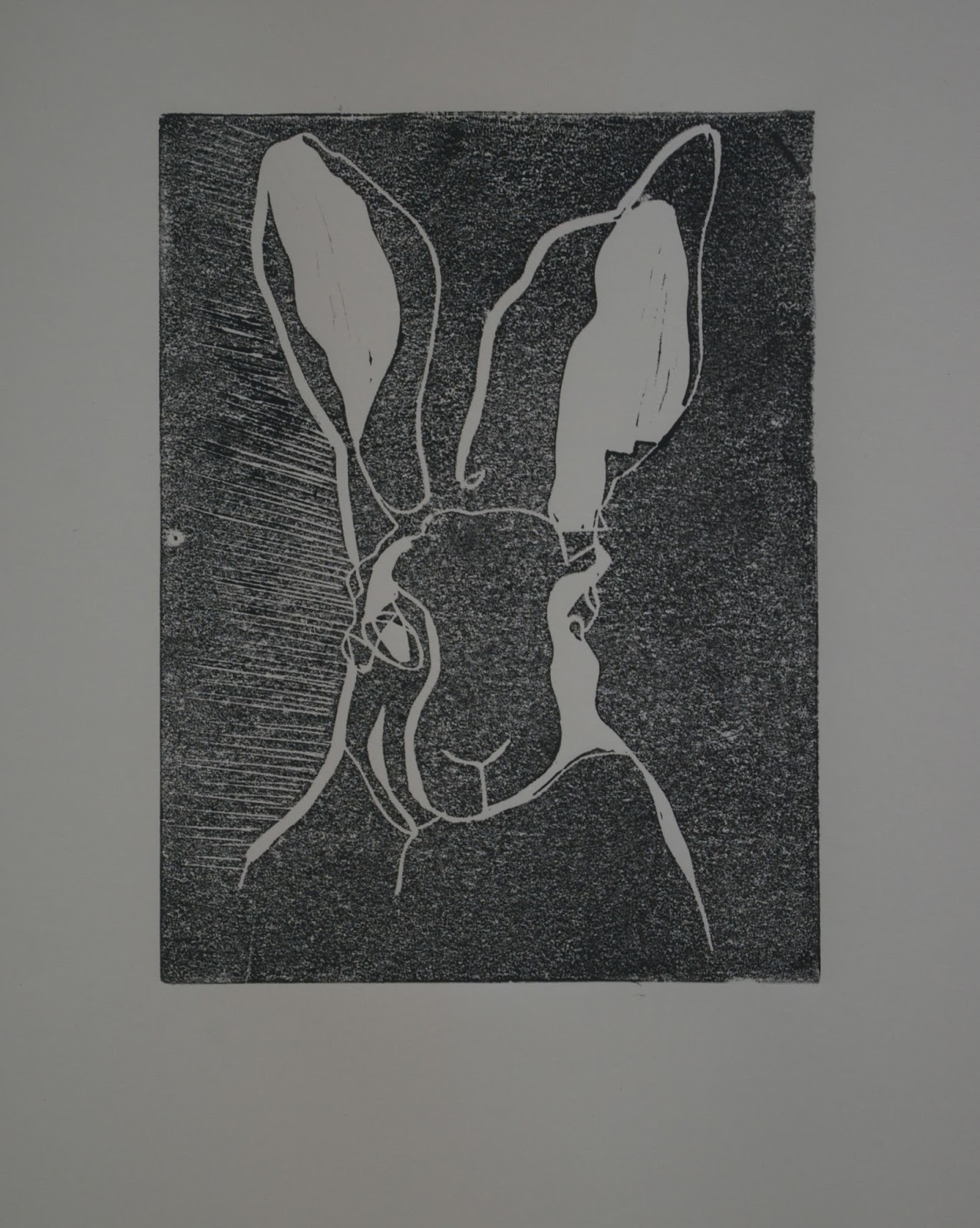
I had done some blind continuous line drawings (i.e. without looking at the paper) and I wanted to see if I could preserve the flow and spontaneity of the blind drawn line when using the cutting tool on a traced image. 

Blind Drawings from Sketchbook

I pulled my first print onto cartridge paper. The result was pretty ropey - the ink did not transfer well - maybe there was not enough ink on the plate or not enough pressure applied. There were also marks all over the print from stray little buts of lino. I realised I'd made a mistake by putting my inking block on one end of the table on which I was cutting - small bits of lino had pinged off into the ink as I cut. 


Water Based Ink on Cartridge Paper
Speedball Baren
I remembered from the monoprint workshop I'd attended that the coated paper had given a stronger print because the ink sits on the surface better. However at that workshop we used oil based ink and a press and the paper we used was very thin. I tried hand pulling a print onto my thicker coated (photo) paper. This was unsuccessful - the results were very patchy and it almost seems to show the texture of the baren.

Water Based Ink on Coated Paper
Speedball Baren
Thinking that perhaps the problem was the thickness of the paper, I decided to try printing on the thinnest paper I had - tissue paper. This was quite satisfying as I could see the print developing as I burnished it and the tissue paper was strong enough not to tear when I peeled it away. The resulting print was darker. There were some lines form where the tissue had crumpled slightly - something that might be exploitable in future. There were unfortunately still some marks surrounded by white halos from stray bits of lino.

Water Based Ink on Tissue Paper
I liked this simple line drawing but from a distance it didn't have much impact. I experimented with gradually cutting away more areas of the print and printing on cartridge paper, tissue and thin newsprint:

Second Cut on Cartridge Paper


Third Cut on Newsprint

Third Cut on Tissue Paper

Fourth Cut on Tissue Paper

Fifth Cut on Tissue paper (note the mark from a
large piece of stray lino)

Fifth Cut on Newsprint

In the last print (the fifth cut) I realised I'd lost the definition of the side of the hare's face because the white section was adjacent to the almost white background. This was OK as a series of experiments, but I actually preferred the original line drawing before I started cutting into it - perhaps it would have been better just to selectively strengthen some of the lines rather than cutting away sections of lino contained by those lines. It's all a learning process. This wasn't a planned process so it isn't a surprise that the results are not perfect. 

The cleanup process with the water based inks was much easier than with the oil based inks - they might be useful for proofing when I'm not sure whether I've cut enough out. 

What I learnt:

  • Line drawings can be transferred quite well to lino without losing the original fluid character of the line
  • A lot of pressure is required with at least two fingers in the bowl of a spoon when hand burnishing 
  • Burnish in a methodical manner from one side of the plate to the other to avoid missing patches
  • Water based inks are not as thick and don't produce as vivid a print when hand pulled as the oil based inks
  • The thickness of the paper makes a dramatic difference to the print pulled by hand (thinner is better)
  • Water based inks are easy to clean up
  • Don't cut the lino on the same table as your inking block - EVER!!!
  • A variety of tools handled in different ways can produce a large vocabulary of marks on the lino
  • Remember that your print will be the reverse of what you draw on the lino if you are drawing freehand (tracing automatically compensates for this reversal)
  • Stop cutting before you think you should and proof the print - you can always cut more away but you can't put it back!

Things to Learn and Try:

  • Using the water based inks on various papers through the press 
  • Visualising and planning lino prints other than simple line drawings 
  • Reduction linocut technique
  • Etching Lino 


Saturday, 10 September 2016

Starting Out: Preliminary Research

There is a brief section in the introduction to the course which has a little of the history of printmaking described but there are very few images included so I decided to search online for images linked to the descriptions. The sections in italics are extracted from the course notes. My own thoughts are not in italics. 


"The history of printmaking on paper is relatively short compared to that of painting or sculpture. However, in a simple form, handprints are to be found in the caves at Lascaux in France dating from 15,000 years ago."


Fig1: Cave Handprints dating back 15.000 years

I find it fascinating that we can see the form of the artist's hands across 15,000 years and that  there was the urge to create an image even so very long ago. 

"It was not until the invention of the printing process in the middle of the
15th century that artists were able to explore the opportunities that mass production of printed images offered to communicate ideas. The earliest form of printing images, which preceded that of written texts, is relief printing in the form of woodcuts. A wooden block was prepared and cut into to leave the relief of an image, sometimes with a simple text, and covered in ink. This was then printed onto paper to produce several good impressions before the wooden block wore out in the process. As a result simple woodcut prints became a cheap and relatively easy way of distributing small religious images and texts to people for their own private devotions"

Fig 2: Christ as Man of Sorrows, artist unknown
15th century woodcut
Before the Renaissance, the artist was considered more like a craftsman, producing images for a particular purpose. "Art fir Art's sake" was not really a phenomenon of the time. In many cases, art would be commissioned for a religious purpose by a rich patron in an attempt to demonstrate their piety. The invention of the printing press was a pivotal event in the 15th century allowing access to text and images to many many more people than would previously have been able to see them. 

Albrecht Dürer was a master artist of the renaissance. Compare the detailed work in his woodcut below with the relatively simple image above:

Fig 3: Albrecht Dürer, The Four Horsemen of the
Apocalypse, Woodcut 1498


"However, woodcuts have one main disadvantage. The amount of detail possible in them is very limited and soon artists discovered a more suitable medium to allow them to reproduce finely observed details - the engraving. This is an intaglio print method where fine lines are scratched into a copper plate, filled with ink and printed. The artist is able to draw the most minute details directly onto the copperplate as with a hard pencil onto paper.
Together with the woodcut, engravings became the way in which images were distributed all over Europe. Artists could learn ideas from each other and reproduce, or develop them. In this way printed images from Renaissance Italy spread north to influence the work of artists such as Albrecht Durer, himself a master of the woodcutting and engraving methods. "


Fig 4: Melancholia, Engraving, Albrecht Dürer 1514
Melancholia, shown above in a rather poor reproduction is considered to be one of Albrecht Dürer's master prints. It has been the subject of much speculation as to how it should be interpreted who I do not intend to discuss here. It is included here as an example of the intricacy and fine craftsmanship that is a achievable with engraving.
An amazing range of tonal values and building of very detailed form has been achieved here with different types of hatching and directional marks. 


"Throughout the following centuries more and more printmaking techniques were developed and invented. As the mass distribution of printed literature increased and became cheaper to produce, so too did the reproduction of printed images. These images were often copies of master paintings and helped spread ideas and visual records round the world. The printmaking processes such as etching and engraving, mezzotint and aquatint also enabled artists to make original printed art works rather than copies of existing paintings and sell them to a wide audience. Several copies of the same image could be made from each plate to be sold to an up-and-coming middle class looking to decorate their homes with original and contemporary art work. In this way art prints could be sold more cheaply than a commissioned painting and became affordable to a greater number of people as well as providing the artist with an income.

Rembrandt’s mastery of the etching technique was widely acknowledged during his lifetime. It is clear from looking at his prints that he is using the etching medium to fully express his creative ideas. He exploits the full expressive range of the process to create works of the same quality of intensity as his paintings. During his lifetime Rembrandt’s etchings became highly sought after and connoisseurs formed collections of them, many of these collections still exist today and form an amazing record of the evolution of Rembrandt’s etchings."


Fig 5: Rembrandt Van Rijn, Self Portrait in a Cap with
Eyes Wide Open, Etching, 1630
Rembrandt made very many self portraits throughout his life. This etching is part of a group in which he was experimenting with different facial expressions. The relatively loosely hatched lines give an impression of rapid execution which fits with the idea of this being a fleeting expression. However, it is clearly a posed expression and therefore looks a bit like and over-acted mock surprise. 


Fig 6: Rembrandt Van Rijn, The Entombment,
 Etching, Drypoint and Engraving 1654
The entombment shown above was produced in several different states or versions. He was able to alter the darkness of the image by altering the amount of ink he wiped from the plate. He eventually produced a very dark image in which only the figures were illuminated by wiping selectively only in these areas. This reflects the profound darkness of the shadows with only faces illuminated in many of his paintings. 
By selectively wiping, Rembrandt has effectively created a monoprint rather than an edition of identical prints. 


"At the same time the painter and printmaker Giovanni Benedetto Castiglione was working in Italy and is credited with the invention of the monoprint." 


Fig 7: Giovanni Benedetto Castiglione,
The Creation of Adam. Monotype 1642

In the image above it can be seen that the artist has worked in a subtractive manner by covering a plate with black ink and then scraping and wiping away ink to reveal the image. 


Fig 8: Another monotype by Giovanni
Benedetto Castiglione

This appears to have been created by an
additive process. 


"In England, about a century later, Hogarth achieved fame and some financial success by reproducing series of his paintings as engravings. These paintings depicting moral tales appealed to the popular market and sold in large quantities. Using his early training as a book illustrator Hogarth used the print medium to market his talents as an artist to a wider audience. Unlike Rembrandt however, he did not use the medium to express new creative ideas which were different to those he used in painting."


Fig 9: William Hogarth, A Rake's Progress: Arrested for
Debt. Oil on canvas 1732-5

Fig 10: William Hogarth, A Rake's Progress: Arrested
for Debt. Engraving 1734.


The examples above come from Hogarth's series "A Rake's Progress" which describes the decline in circumstances of a rich heir who squanders his money and ends up in debtor's prison and eventually in Bedlam Hospital when he loses his mind. The print is pretty much a copy of the painting with a few added details. I find I can't really warm to these images with their 18th century morals and theatricality. However I can see parallels here with modern day comics or 'graphic novels' as well as with film storyboarding. 


"Colour printing processes add another range of opportunities for artists. Combining expressive and commercial opportunities for working with a wide audience, artists have exploited the use of the ‘art’ print. In the mid-19th century multicoloured woodcuts from Japan were finding their way to Europe. These highly skilled printed images had one of the most significant influences on the development of Western contemporary artists for decades. The Japanese prints showed dramatically composed scenes where the subject could be partially cropped out of the picture, areas of flat colour and sweeping lines."

 
Fig 11: Crossing the Sumidagwa River, Toyohara Kunichika
Colour Woodcut on Japan Paper 1855

Fig 12: Under the Wave off Kanagawa. Katsushika Hokusai
1830-32. Colour woodcut on Paper. 

The multicoloured prints were achieved by using a block for each separate colour some contained up to 16 different colours which would be laborious and require excellent print registration for each subsequent layer. 

"Artists including Degas and Manet were among the first to adopt the ideas found in these Japanese woodcuts in their own paintings. Whistler, also an admirer of the prints, used their ideas on composition and design in his paintings, etchings and engravings"


Fig 12: James Abbott McNeill Whistler, Upright
Venice. Etching and Drypoint 1879-1880
Although the image above is not coloured like the Japanese prints, Whistler has experimented with composition influenced by these prints by placing the horizon line very high and using areas of flat space with little embellishment. Also an asymmetric composition. 


"In Paris, Toulouse Lautrec developed lithographic posters and extended the understanding of how colour could be used by mixing his own expressive palette. The influence of fashionable Japanese woodcuts is clear in his simplification of detail and the way in which bold shapes and patterns form a highly organised image"
Fig 13: Henri de Toulouse-Lautrec, Moulin Rouge
La Goulue. Lithograph 1891

It is arguably easier to read the Japanese influence in Toulouse-Lautrec's posters than in Whistler's work. The bold areas of flat colour and dynamic somewhat diagonal composition with cropping of the main protagonists clearly shows the influence of the Japanese woodblocks on his style.


"The comparison between Rembrandt’s and Hogarth’s use of the print to reach their respective markets emphasises two of the important ways artist use prints. Firstly the print medium, whether it is relief or intaglio, lithograph or screen print, has unique expressive qualities for the artist to exploit. Once familiar with print techniques, an artist can communicate a wide range of visual / emotive ideas. Secondly the print process enables the artist to make multiple reproductions that can be more affordable to a wider audience, which does not normally invest in original art work."

The above could have been written as a summary of why I would like to learn printmaking!


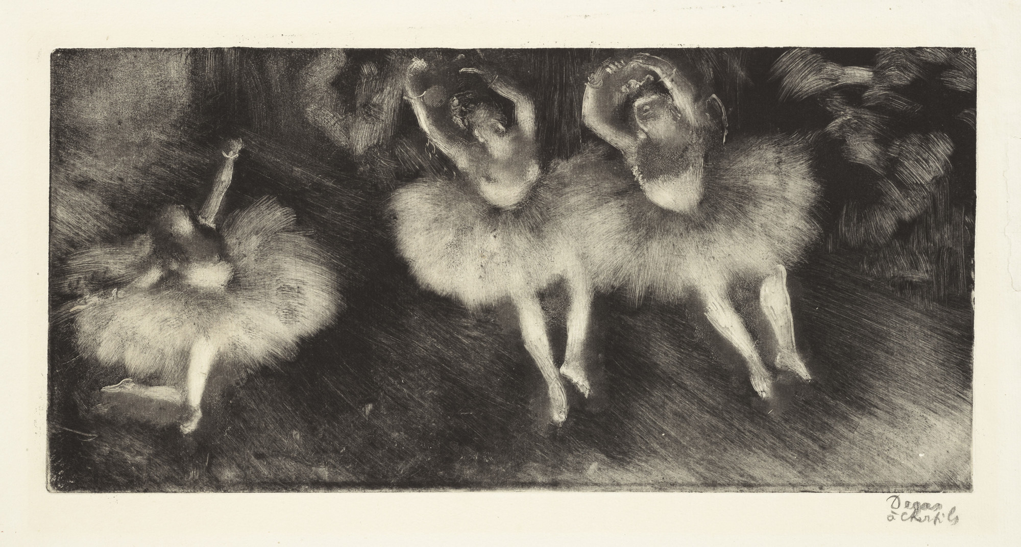
"It may surprise you to discover that many early 20th century painters explored printmaking methods as a means of creative expression. Degas, for example, developed monoprints representing his ballet dancers; and Picasso and Matisse made use of linocutting to produce prints."

Click Here for an example of a Degas Monoprint on the Moma website

I love this monoprint- It has wonderful movement and the subtractive manner of its execution (wiping ink from an inked plate) has revealed a real sense of contrast which evokes the strong illumination of the dancers on a darkened stage. I sense that this has been executed rapidly and confidently which fills me with admiration. I prefer this to many of his larger and prettier masterpieces in oils and pastels


Click Here to link to an article on the Phaidon website about Picasso's approach to Reduction Linocut

The article and video in the link above not only show two exciting and very diverse linocuts by Picasso but also provide an insight into the process of reduction linocut for beginners like me!

Click Here to link to selected drawings and graphic works on the Henri Matisse website which include three linocuts


The three linocut prints shown in the link above were executed in 1942. It is interesting to see them as part of Matisse's wider drawing practice. There is a progression from his quite detailed lithographs in the 1920s to the very reductive style of drawing in these prints. He tries to capture the essence of his subject with just a few lines. In the case of linocut they are printed in negative with the cut lines coming out white - something which adds to their visual impact compared to the drawings on white paper. This reductive approach  I very much admire and would like to emulate.

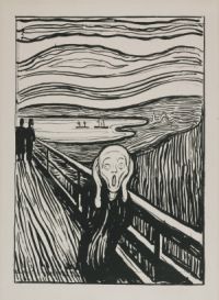
"In the late 19th century Munch and Gaugin began to exploit the grain in wood as an important element in their woodcuts. Since then many artists have used opportunities to incorporate the natural texture of wood, and expressive cut marks in their prints. The German Expressionists of Die Brüke in particular use the intrinsic nature of woodcuts as a major form of expression."


Click here for a brief explanation of Die Brüke and some examples of their work including woodcuts


The woodblock print of "The Scream" clearly demonstrates that Munch has incorporated the woodgrain itself as part of his expressive mark making. 


"Interest in printmaking continued throughout the 20th century with many artists exploring the creative possibilities of, and extending the range of, printmaking media through experimentation with new materials and techniques to express their artistic ideas. Some continue to use and develop traditional methods such as etching, lithography and woodcuts whilst others extend the expressive range to achieve new and exciting results.

Contemporary artists continue to use printmaking as a significant part of their work. David Hockney, Peter Blake, Briget Riley, Lucien Freud and Tracey Emin have all produced prints in a variety of media alongside their paintings and installations. They have all recognised the creative potential and expressive range of printmaking and use many of its forms to express their artistic vision."


David Hockney has used a number of printmaking techniques during his career. On his website are numerous examples of lithographs, etching, aquatint and 'home made prints' in which the process is not specified. His etchings include a series entitled 'A Rakes progress' after Hogarth's earlier series - a modern interpretation. 


Peter Blake is renowned for being one of the founders of the pop art movement in the UK - as such, many of the images in his screenprints are taken from popular culture such as pop stars, sports stars and characters from comic books. He was the designer of the iconic cover of the Beatles's - 'Sergeant Peppers Lonely Hearts Club Band' and has designed covers for numerous other artists  including The Who and Oasis. 
His printmaking output is mainly in the form of Screenprints and Lithographs


Alongside her large scale works in paint on canvas or board, Bridget Riley has also produced screen prints on paper. The example above 'Blaze' from 1964 is a black and white screen print which creates the optical illusion of vibration and movement and even colour through the relative positioning of the shapes. Other examples such as her series of 'fragments' which are screen prints on plexiglass play with three dimensionality as an illusion. Her later work in colour creates vibrations though the juxtaposition of carefully chosen stripes of colour. 

Freud is most well known as a prolific painter of the human form and for his mastery of flesh. The example of an etching above comes from his early period of venturing into printmaking - here the drawing is almost naïve - simplified and somewhat flattened. He started etching again later in his career - comparing the image above with "Woman with an Arm Tattoo" of 1996 and "Large Head" (Leigh Bowery) of 1993 (you can view the others by scrolling along below the fist image) there is a marked difference in the approach to the drawing - there is more concentration on folds and directions in the skin.

Click here to link to an an article from the Independent from 2010 in which Tracy Emin talks about her relationship with printmaking

Tracy Emin's work is largely autobiographical. Although she is more widely known for her more sensationalist installation work such as 'my bed' and 'everyone I've ever slept with', Her original degree incorporated printmaking and she returns to it again and again. She produces etchings, lithographs and monoprints. I will go into more detail about her monoprints when I get onto the research point for back drawn monoprints in project 3 of part one.

 Sources of Images:

Fig 1: http://blogs.scientificamerican.com/observations/files/2012/06/el-castillo-hands.jpg
Fig 2: https://arthistoryunf.files.wordpress.com/2013/11/man-of-sorrows.jpg
Fig 3: https://upload.wikimedia.org/wikipedia/commons/thumb/2/29/Durer_Revelation_Four_Riders.jpg/722px-Durer_Revelation_Four_Riders.jpg
Fig 4: https://upload.wikimedia.org/wikipedia/commons/1/18/Dürer_Melancholia_I.jpg
Fig 5: https://upload.wikimedia.org/wikipedia/commons/f/f7/B320_Rembrandt.jpg
Fig 6: https://upload.wikimedia.org/wikipedia/commons/9/90/Rembrandt_van_Rijn_-_The_Entombment.jpg
Fig 7: https://upload.wikimedia.org/wikipedia/commons/5/56/Giovanni_Benedetto_Castiglione_-_The_Creation_of_Adam_-_Google_Art_Project.jpg
Fig 8: https://upload.wikimedia.org/wikipedia/commons/b/b6/Giovanni_Benedetto_Castiglione_002.jpg
Fig 9: https://upload.wikimedia.org/wikipedia/commons/d/d8/William_Hogarth_-_A_Rake's_Progress_-_Plate_4_-_Arrested_For_Debt.jpg
Fig 10: https://eclecticlightdotcom.files.wordpress.com/2016/03/hogarthrake4.jpg
Fig 11: http://www.artgallery.nsw.gov.au/media/collection_images/9/9734.a-c%23%23S.jpg
Fig 12: https://upload.wikimedia.org/wikipedia/commons/6/66/James_Abbott_McNeill_Whistler_-_Upright_Venice,_from_the_%22Twenty-Six_Etchings%22,_also_known_as_the_%22Second_Venice_Set%22_-_Google_Art_Project.jpg
Fig 13: https://commons.wikimedia.org/wiki/File:Lautrec_moulin_rouge,_la_goulue_(poster)_1891.jpg


Tuesday, 6 September 2016

Research Point: 'Coursemates'

Before you get started, see if you can find any learning logs (blogs) online by other OCA printmaking students:

Below are links to some of the learning logs of fellow OCA printmaking students that I have found. Some I found just by using a search engine and others from looking at the 'course mates' section of the OCA website. 
During my Drawing course I found referring to other students' blogs both helpful and inspiring. However I did have to use self discipline just to occasionally look at them for reference. There was always the temptation to look at what other students had done before attempting a project - this is not necessarily helpful. In the end I found it was better to attempt exercises first and look at others' work afterwards. There is also sometimes disappointment when students who you find inspiring withdraw and their blogs are left incomplete. 
Following other students' blogs can help to alleviate the sense of isolation that comes with distance learning. In addition there are a number of OCA student groups on social media. I used the 'OCA sketchbooks' group on Facebook a great deal during my previous studies and will continue to do so. I have also joined the "OCA printmaking' group on the same site. 

The top two blogs on this list are by Sue Parr and Steve Cussons. I have communicated with both these students online and have met Steve on a couple of occasions via Study visits. (Steve was also our OCASA rep last year). Sue very kindly shared a link to her blog when I was considering starting the printmaking course. 

I am sure that I will be looking at these blogs on many occasions during the course. 

https://suesprintmakingblog.wordpress.com

https://greenmangle.wordpress.com

https://pamwright66.wordpress.com

http://print.zemniimages.info

http://bella-janes.blogspot.it

https://mycreativejourney.net/2015/01/30/printmaking-1-assignment-one-assessment-criteria/

https://mifmccann.com

https://anneprinting.wordpress.com

https://sueburgess3.wordpress.com

https://learninglogforgina.wordpress.com/category/printing-1-introduction-to-printing/

Monday, 5 September 2016

Student Profile

Write a bit about yourself to tell your tutor a little about any past experience you have and how confident you feel about some of the skills of printmaking. This is your first link with your tutor and gives you the chance to introduce yourself. Give your tutor as much information as you can about your previous experience, your reasons for exploring printmaking and what you expect to achieve from taking the course:

Transcript of the email to my tutor:

Dear Michelle,

My name is Aylish Giamei and I am a mature student. This will be my third course with the Open College of the Arts. 

Before I first enrolled with the  OCA I had always had the intention of doing something creative in my free time. However, just having vague intentions meant that 'free time' was an elusive commodity. In reality I did very little in the way of creative activity between finishing my art A level in the 1980s and enrolling on the OCA course 'Drawing 1' in 2012. 

I have a somewhat unusual lifestyle. I have been a veterinary surgeon for 24 years. In 2008 I moved from the East Midlands to rural southern Italy to be near my husband's family and to provide a different quality of life for my son. Owing to a series of events and alterations in circumstances when we first arrived in Italy, I have ended up commuting to the UK for work on a regular basis. I currently spend two weeks of each month working for Leeds Emergency Vets in Morley, West Yorkshire and the rest of my time at home in Italy. My odd lifestyle means that I cannot attend regular leisure classes but it works out well for distance learning as I have the opportunity to study and create during my two weeks off. I have set up a studio in our spare room so they I have my own space for messy activities. 

The OCA drawing 1 course was a great introduction for me. I started off with very little confidence after such a long period of being out of practice with pencils. I gained a great deal from the course and thoroughly enjoyed the learning process. Assessment went better than I had expected (or dared to hope for) and I was pleased that some of my work was selected to feature in OCA promotional material and in the current version of the level 1 drawing course as an example. 

My original intention had been to follow the painting degree pathway. However, after completing two assignments of 'Painting 1: The Practice of Painting', I realised that this pathway wasn't for me. I found the course rather prescriptive and repetitive - like doing drawing 1 all over again but with paint. More importantly, however, I just wasn't enjoying the process of painting. 

I decided to withdraw from the degree and continue as a leisure student. My reasoning was that without the additional pressure of preparing for assessment, I would be more relaxed and more creative. In reality, the psychological change from degree to leisure student meant that my studies just seemed less important and other chores and duties of daily life encroached more and more on my study time. Ultimately I couldn't find the motivation to complete POP 1 and I withdrew altogether. 

So why am I back again? Well, I hadn't completely given up on being creative. I still needed my 'fix'. In the last few months I have attended several one day courses at Leeds College of Art. These have included taster sessions in lino printing and mono printing. I got very excited after those courses, and the enthusiasm I felt during drawing 1 has returned. I'm hoping I've got my learning mojo back after the disaster of POP 1. I intend to continue to attend courses and workshops while studying printmaking 1 because I think it's a good (albeit expensive) way to alleviate the sense of isolation that can come with distance learning. 

I have re-enrolled as a degree student on the newly available drawing pathway. I have chosen printmaking 1 as my optional level 1 course, partly because printmaking and drawing have so much in common and partly because I relish the technical challenges involved in finding ways to print at home without investing in very expensive equipment. I also realise that the only original works of art that I have ever actually bought are prints. I have a number of etchings and  a woodblock print hanging in my house. This is partly because prints can be less expensive to own than paintings. However, in my case it is mainly because I am drawn to the quality of the image and lines and the density of the ink on these images. 

I like the position of limited edition prints somewhere between the exclusive, individual one-off and the mass produced image. It somehow seems less elitist than for example painting or installation art notwithstanding the high level of technical knowledge and expertise required to produce the image.  I also like the fact that there is an intermediate stage between the idea and production of the image with the production of the plate or matrix. This allows for lots of creative possibilities for manipulating the image at various stages. It's all very exciting and I hope to gain numerous new ways of making a mark on paper from my studies. I can't wait to get started!

On a practical note, I have recently found out that the West Yorkshire Print Workshop in Mirfield is easily accessible by train from where I work in Morley. Given that I work afternoons and evenings (2-10 or 4-midnight), I am hoping that I will be able to join and to use their facilities mornings and or Saturdays when I'm away from home. I have booked to attend a two day course in reduction linocut technique in September so I will enquire about membership at that time. My only regret is that I did not research this earlier as I would have loved to attend the summer school that you you recently taught there. Your work is inspiring and I look forward to drawing on your wealth of knowledge and experience over the next 15 months or so. 

I look forward to hearing from you
Best Regards

Setting Up the Studio


I am lucky enough to have a reasonably large spare room which I have converted into a studio. This means I can make a mess without having to clear a space for everyday life and mealtimes. It is my own space.
 The floor is tiled with ceramic tiles which means I am not too worried about mess and spillage. 

I have abundant bookcases, shelving and cupboards as well as a chest of drawers from IKEA which takes paper of up to A2 size. I have two tables on which to work. 

Studio

An old set of bunk beds has been converted into a deep shelving unit for paper and canvas of greater than A2 size


Bunk Bed Shelving

For the printmaking course I have bought a ceiling mounted laundry drying rack. It has five bars, each of which can be raised or lowered individually. I will hang prints from the bars using bulldog clips. This allows me to dry my prints up out of the way.


Drying Rack

I have invested in basic equipment for printmaking including rollers or brayers and various inks. The spray bottles contain vegetable oil and water with washing up liquid for cleaning up oil-based inks. I also have a very large stack of rags (mainly vests and tee-shirts which my son has grown out of and are too scruffy to donate)


Rollers, inks and cleanup equipment

When I attended the mono print workshop, one of my fellow students gave me a tip that cheap glass chopping boards make great inking slabs so I bought a couple of these from Wilko.


Chopping board for an inking slab with
palette knives and lots of gloves

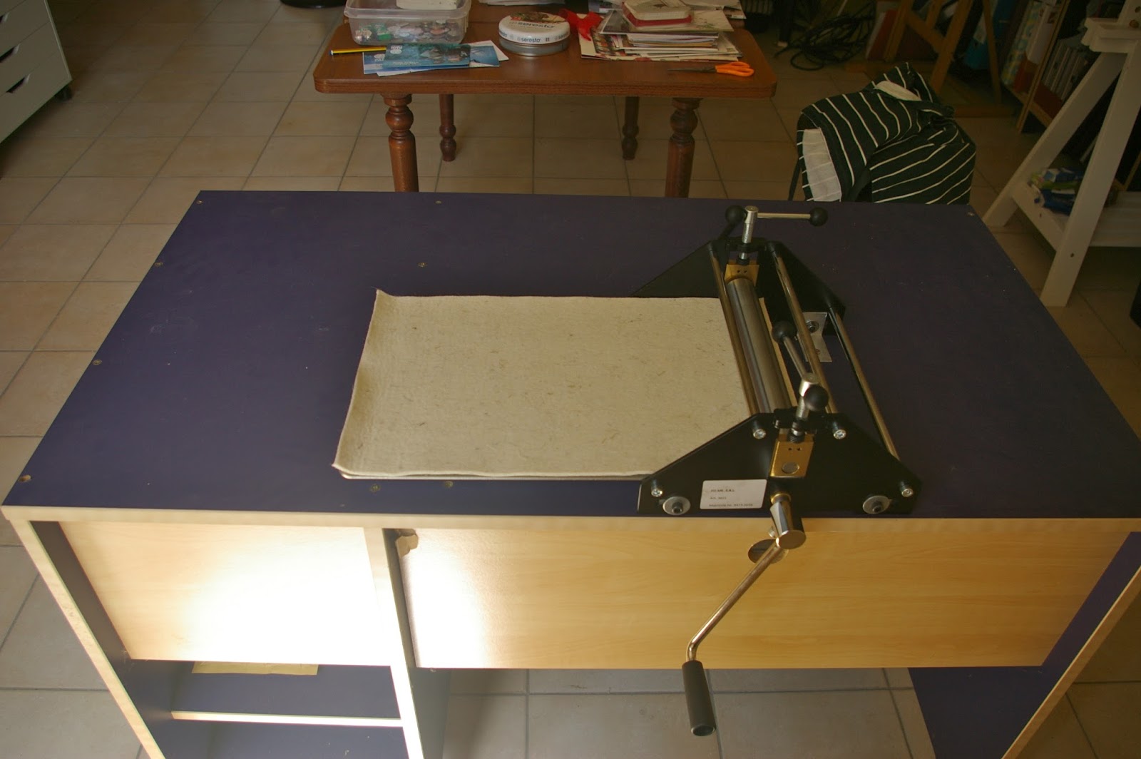
Although I will be mostly doing my printing by hand throughout the course, I found a small school etching press on special offer (FOME Italia). I couldn't resist putting my hand in my pocket. I have no idea how good or otherwise this will be. Its scope is limited because the print bed will only enable me to print up to A4 size but it looks reasonably sturdy and I have fixed it to an old MDF desk to make it stable. Even if it isn't much good I'm sure it will manage a few christmas cards each year!


FOME school etching press
Now I have my space organised it's time to make a start. 

Monoprinting Workshop


I attended a one day monoprinting workshop at Leeds College of Art which was tutored by Mick Welbourn. http://mickwelbourn.blogspot.it

We were not asked to bring any visual source material with us for this workshop as the workshop was more about the process of the printmaking rather than planning an end result. This was quite liberating as it allowed stress-free exploration of the masked monoprint process.


What We Did:

We made positive or negative masks out of cartridge paper in random shapes or geometric shapes and placed them on the plates. We then went through various stages of moving the masks around and overprinting.  We used Hawthorn 'stay open' oil based inks. The first prints were taken onto cartridge paper. Ghost prints were taken onto coated paper. This paper causes the ink to stay on the surface giving a glossy and more vibrant result than with a more absorbent paper. It is a commercial paper like that used for printing magazines and is quite thin. I found the results on this paper quite attractive. All of the prints were taken using an etching press.


I did not try to register the plate accurately - just plonked it on an hoped for the best - the result is lots of overlapping at the edge of the print. Registering the plate is something I must learn.

Masked Monoprint on Cartridge Paper
Masked Monoprint on Coated Paper
In the print shown above the translucency of the ink allows colour mixing on the print - something to be exploited in the future.

Masked Ghost Monoprint on Coated paper

Masked Ghost Monoprint on Cartridge paper


Mark Caused by a Contaminant on the Plate

Part of the way through the process it seems I had not cleaned the plate well enough and a piece of dust or dried ink was attached to it. This resulted in a spot which didn't print well which came out white or grainy and was repeated on several of my prints as I didn't realise when the cause of it was until I looked back through all my prints and realised that the mark was in a similar position on each of them. On one of the prints which was in shades of green, the mark seemed to glow out in a lime green colour - I really liked the effect but am sure it would be very difficult to repeat it! I suppose that's part of the beauty of monoprints as they can give unexpected results.

While I was wiping the plate clean using vegetable oil as a solvent I really liked some of the marks that were made on the plate so I decided to print from the partially cleaned plate. I placed a roughly torn paper mask on the plate. Because the ink was runny and oily and the mask was thin, the ink under-ran the edge of the mask creating a double outline.


Print Taken from Partially Wiped and Scraped
Plate with Roughly Torn Mask

Later in the day we went on to explore a collatype variation of the monoprint. We used a collection of tape which we applied to a stiff card to create a plate. These included, masking tape, duck tape, woven mesh tape and my favourite which was thick aluminium foil tape used for sealing ducting. I crumpled this tape and then flattened it out before sticking it to the plate. I then used two different colours of ink one rolled from one end and the other rolled in the opposite direction. The result was some spectacular texture.


Print Using Aluminium Tape and Cardboard Backing
in Process Cyan and Magenta Inks
Print Taken from the Same Plate Using Process
Magenta and Sap Green With Additional Marks
From Sprayed Vegetable Oil.
I also made marks on the plate by spraying vegetable oil onto it. It produced some beautiful marks but unfortunately, it also leached into the paper producing an oily mark round the edge of the print. I really loved the marks and textures created but the print as a whole would not be suitable for display because of the oily mark around it. Parts of the print could be used for example in collage. 

Aluminium Tape, Mesh Tape and Masking Tape
Additional textures were created using the mesh tape and the textured surface of masking tape.

As Above in a Different Colour Combination Plus Oil


Aluminium Tape, Masking Tape, Mesh Tape

As Above - Different Colours
I also indulged in a bit of scraping to create white marks during a spare five minutes. 
Marks Made by Scraping Into an Inked Plate
The pace of this workshop was rapid. I came away with a lot of prints compared to the number I produced on the lino workshop. I think this was largely because I didn't spend any time planning a composition but just went through the printing process to see what would happen. 

Because of the fast pace I didn't pay much attention to the cleanliness of my fingers of handling of the paper so a lot of my prints have fingerprints round the margins - not a problem right now as I am just playing at creating textures - However, I will need to address this as I move forward.

What I learnt:

  • Basic Masked Monoprint technique - versatility and process 
  • Moving inked masks around and reprinting from the inked side
  • Using the etching press
  • Some ways of making texture with household materials
  • Oil can make great marks but can also ruin the paper
  • Inking two different colours in opposite directions on a textured surface for interesting results
  • Unexpected results or 'mistakes' can sometimes be interesting
  • Coated paper is good especially for 'ghost' prints

Things to do and things to improve on:

  • Learn to register the plate
  • Clean fingers or paper 'picks' when handling the paper
  • Clean the plate properly unless you want unexpected marks on the print
  • Try monoprinting without a press
  • Explore other ways of creating texture
  • Combine monoprinted texture with drawing
  • Think about the effect of colour mixing when overprinting inks