Saturday, 9 June 2018

Project 6: Single colour linocut - third attempt

My second attempt at the single colour linocut taught me the importance of planning before cutting. Unfortunately, this made me feel constrained. My most successful pieces in part one of the module (monoprints), had been abstract prints which I had not planned and which had come about in a more organic way through experimentation. I was starting to think that Lino may not be my thing and longed to go back to the fast-moving experimentation of monoprint and the immediacy of drawing. On the positive side, I do enjoy the actual process of carving - it is quite meditative. The upshot of this is that I rebelled against the rules I'd given myself after my second attempt at project 6. I decided to do the opposite and just carve the Lino without planning at all. This was partly inspired by the research I'd been doing, in particular the work of Daniel Zeller.  I thoroughly enjoyed doing this as there was no pressure. 

I started with a blank piece of grey Lino.I made circular marks by spinning the tip of the cutting tool in the surface of the Lino taking out a small core. These marks were inspired by the bacteria from my sketch book. I added some undulating thin linear marks to represent the fibrinous tendrils of an expanding colony. I carved for a while and then proofed it onto newsprint:


First proof onto newsprint using water based ink

What I realised at this point, is that I'm hopeless at visualising the composition in reverse. My eye in this composition seems to come in at the lover left hand corner and swiftly be drawn out of the composition at the lower right hand side. There also seemed to be just too much black and not enough interest. I decided to try to adapt the composition somewhat to try to bring the eye back into the print in a circular motion. I drew directly onto the Lino with a  Posca (acrylic) white pen and then proceeded to carve. 

I proofed this again. I neglected to wipe the plate down before inking it up. Consequently I ended up with lots of tiny bits of Lino in my ink so the proofs were of very poor quality. 


Proof in water based ink onto the rough side of cheap Chinese paper
Proof onto thin cartridge paper using water-based ink and printed using the bottle jack press


I wondered whether adding some colour might help so I splashed and brushed some watercolour over it. It didn't help and the water based ink ran into the colour creating a muddy mess:

Although - on looking at its through the camera view finder, the image reminded me of some kind of bizarre sea creature with tendrils - a bit like a lion fish. I'm abandoning this block for now as I need to move on, but there is the possibility I may revisit it to try to develop this idea. 

What I learnt:

  • I really do need to plan the composition as I can't visualise my image in reverse while I'm working
  • ALWAYS clean the plate before inking up otherwise you will end up with tiny grains of Lino in your ink and on your roller which will show up with white haloes on your print. 
  • The rough side of the Chinese paper is difficult to print onto - it needs a lot of ink. It gives a texture to the print but it's difficult to get a clean print. Try using the smooth side next time. (This was the first time I'd tried printing on this paper because I'd run out of Japanese paper and I happen to have a large roll of the Chinese paper in my studio and limited funds at the moment)


Project 6: Single Colour linocut - second attempt

My first attempt was OK as far as it went, but the subject matter of onions wasn't particularly interesting. I decided to develop some of my sketchbook experiments from my small scale sketchbook about medicine and the body. (actually my first subject was sunspots, but after doodling on these for a while I realised the reminded me of fungal or bacterial cultures on Petri dishes and it went on from there.)


Sketchbook:sunspots pencil and ink

Sketchbook: Sunspot - white acrylic ink on black paper

I also had some very small squares of soft-cut Lino for experimenting with, so I developed some of my sketches into small linocuts, just as an exercise to get used to handling the tools and to experiment with using different papers. 

Sunspots: Small Lino prints on various papers

Sketchbook: Staphylococci - pencil sketch based
on an electron micrograph(E.M)

Sketchbook: abstract doodles based on E.M of
chordae tendinae of the heart


Sketchbook: Pencil and pen sketches of papillary
muscles and chordae tendinae (heart strings)
Small linocut inspired by bacterial colonies
and pencil sketch of chordae tendinae(C.T.)

Linocut of bacteria and sketch inspired my E.M.
of C.T. in graphite and India ink

Linocut of bacteria and pen sketch inspired my E.M.
of C.T.

Pen and India ink sketches inspired by C.T.

Sketches of heart and skeletal anatomy

I decided to develop one of the sketches inspired by the chordae tendinae of the heart. I liked the architectural feel of the chordae and papillary muscles. They reminded me of pillars of rock inside a craggy cave. I thought there would be plenty of opportunity to use different marks to reconstruct the sketch on the lino. 

First I scaled the drawing up to A4 size and then traced it onto my Lino, thus reversing the image. I used soft cut line for this experiment. I proofed the Lino on more than one occasion using water-based ink onto newsprint to assess how much more cutting I would need to do. 


Proof of the linocut in water based ink on
newsprint to show work in progress. 

I printed the block onto cartridge paper and and onto smooth watercolour paper using black oil-based ink (Hawthorn stay-open ink). 


At first I was relatively satisfied with the outcome. I had made marks using a rage of tools including Lino cutting tools, needles and scalpels. However, the prints were hanging on my drying rack for quite sometime, which meant that I kept seeing the in passing. From across the room, I realised that there wasn't a huge amount of tonal variation and, therefore, the print didn't have a great deal of visual impact. 

I decided to try to remedy this with more carving in order to create more areas of white. I thought that this would have the effect of bringing the two chord at the front forward, thereby creating a feeling of more depth:


This tactic worked to a certain extent. I do think it created some extra depth. However, it was executed rather hurriedly without a great deal of consideration of the marks I was making. This meant that some of the detail and variation in the mark making from the previous iteration was lost. It would have been better to proof at stages during this second carving and perhaps make one of the two chordae lighter than the other.
I'm still not satisfied with this print. In retrospect, I think that the composition wasn't great in the first place. The two 'pillars' at the front are probably too symmetrically distributed and your eye gets stuck in the dark centre of the piece. 

Below is an image of the Lino:


I found the soft-cut Lino easy to make marks in. However, there were a couple of annoying problems with it. Firstly, sometimes the pieces don't come away cleanly and if you aren't careful you get small pieces of the Lino dangling but still attached. Secondly, on printing this Lino using the bottle jack press, after several prints, the Lino started to distort. The thinner end where I'd carved more of it away seemed to stretch so the the printed image was no longer rectangular. Maybe this type of Lino is more suited to hand pulled prints. It doesn't seem to be able to withstand the pressure applied by the car back. 

What I learnt:


  • A large variety of different marks can be made even using a limited range of tools. 
  • It is a good idea to proof the Lino more frequently than I did on this occasion as it isn't possible to go back once you've carved it away. 
  • Soft-cut Lino isn't very robust and although it is soft, I actually find it more difficult to carve than the grey lino.
  • I now recognise just how important careful planning of the composition is. It saves time in the long run. I must make sure that I am happy with the composition BEFORE I start carving in future. 


Thursday, 7 June 2018

Research Point: Contemporary Printmakers - Lino

Research point

Find a couple of contemporary printmakers whose work you like, and reflect on their techniques. How do they use lino? What sort of marks do they make? What could you learn from them?

I have done quite a lot of research here looking at a wide range of printmakers who use or used Lino in their work (not all of the artists I researched are contemporary). I do not intend to give an exhaustive account of every artist I looked at - I will include very brief comments on most but then talk in more detail about the artists to whose work I am drawn and which seems to have more direct relevance to whet I would like to do. 


Examples of linocuts by Picasso, Gertrude Hermes and Angie Lewin

  • Picasso - very bold colourful use of the expanses of flat colour possible with Lino. Did he use multiple blocks as these are bold primary colours without evidence of other colours showing through.
  • Gertrude Hermes (1901-1983). I particularly appreciate the variety of mark-making used to create texture - especially on the Stonehenge linocut.
  • Angie Lewin (contemporary) - a very commercially successful printmaker. Main interest is horticulture. Stylised images of plants and nature. Extremely accomplished work but probably not directly relevant to my own interests.
Examples of linocuts by Arthur Homeshaw and Gail Brodholt


  • Arthur Homeshaw  (1933-2011). Stylised landscapes with bold contrasts of colour and tone and very extensive patterning. A wide variety of mark making in evidence over the whole surface of the Lino. His work reminds me both of Paul Nash (especially the shapes of the trees) and Eric Ravilious for the mark making and patterning. I love the patterning and the complexity of this work but the subject matter doesn't interest me so much. 
  • Gail Brodholt (contemporary). Her subject matter is very familiar and talks about life today. Depicts railway stations, commuters on trains and the underground as well as motorways. Exploits the full potential of the medium in the aspect of producing graphic images with areas of flat colour. Less so in terms of the variety of marks made. Her use of colour is wonderful. She really knows how to capture the atmosphere and light effects for example of train tracks at dusk or the artificial lighting on the tube. I can really picture myself in the environments she creates. I am ambivalent about this work. I love the colours and the fact that the work reflects life today but I am more drawn to work which uses lots of textural mark making and I seem to gravitate towards the monochrome. 
Examples of linocuts by H.J Jackson, Angela Cavalieri and Chuck Close


  • H J Jackson (contemporary) creates hand pulled linocuts as he doesn't own a press. His prints are made on multiple blocks (an average of 8 prints from 6 blocks for each (1)). His subjects are often nautical. The multiple layers of ink add to a grainy texture which is suited to his subject matter of rusty machinery and peeling old boats. Again, I find this work impressive and accomplished but the subject matter doesn't interest me so much. 
  • Angela Cavalieri (contemporary) Uses writing as a form of drawing on her large scale works. These are created on canvas using a combination of loco print and oil paint.

Chuck Close

I was already familiar with Chuck Close's large scale portraits which are painted using a grid (almost pixellated) structure. Patterns or circles and ovals of contrasting colours are painted into each square on the grid so the painting looks abstract when viewed close up but from a distance the patterns combine to give an average hue or tonal value and the painting reads as an almost photorealistic portrait. I have always admired this way of working. It seems to be almost an extension of the theories of the pointillists. 

I first discovered that Close had also experimented with printmaking when I visited "The American Dream - Pop to the Present" (2). A very large printmaking exhibition at the British Museum (more about this in a separate blog post). He has worked with a variety of printmaking media including mezzotint (on an incredibly ambitious scale), etching, woodcut and linocut. 

In the reduction Linocut Roy (Click for image online), the image is created using multiple layers of tonal values of grey and black. On each layer the carving is composed of multiple small marks rather than areas of flat tone. This treatment resolves into a grainy texture at a distance, which lends itself well to the wrinkled texture of the skin. 

In Lucas the marks are more linear and directional in nature which describes perfectly the texture of the hair and beard. 

I also found online, a site which shows step-by-step images of the creation of one of his linocuts Alex. The Lino was printed step by step onto mylar and used to create screen prints. Click here to view images of the process of creation

These are quite amazing prints and show just what is possible. There's certainly a lot that can be learnt from this. 

Chuck Close collaborates with master printmakers on his printmaking projects. He had 'an event' in 1988. A spinal artery collapsed, causing paralysis from the neck down. He has regained movement but is still significantly disabled so probably would not have the dexterity to carve the Lino himself. This 'outsourcing' of the physical making of the art object has been common practice throughout the history of art, with the artist directing others to create their vision. This doesn't detract from the validity of the work. Personally, I am attracted to the 'craft' of printmaking (and obviously am never going to be on a level with someone like Close!). Part of the satisfaction for me comes from the act of carving the block or creating the plate. 

This artist also works exclusively with portraiture. He suffers from prosopagnosia - that is , the inability to recognise faces. This may explain his obsession with faces. Repeatedly painting or reproducing the same face helps him to recognise the people around him (although the artist himself says he wasn't conscious that his decision to work on portraits had its origins in his condition) (3)


Examples of linocuts by Richard Galloway and Ade Adesina
Richard Galloway casts an apparently critical eye over aspects of today's society and urban life. Click Here to view examples of the artist's work on his blog. His down to earth subjects include the clientele of a greasy spoon kaff or a pub or the bin men on their rounds. His work 'Dolor'(Here) shows environmental degradation with effluent and fumes pouring out into a city in a dystopian world. The world is populated with somewhat grotesque characters. Lads in hoodies or balaclavas with English bull terriers. Fried chicken shops and payday loan outlets. Enormous shopping trolleys and wheel-clamped cars. Above this mess what looks like a WWII plane and pilot are grimacing. What are we doing to our world? What do we do when we have the freedom to do as we please? Do we all sink to the lowest common denominator? Stuff ourself with fried chicken and buy as much as we can in our consumerist frenzy while destroying the world around us? - At least, that's my interpretation of the scene but I don't know what the artist intended. 

Galloway's linocuts are impressive in scale - His average prints are 1825x1525 but same are larger than this. They are black and white, single block linocuts. Every part of their surface is crowded with action so they feel, to a certain extent, claustrophobic. He creates a very large variety of marks and cuts to create textures and tonal values. I really appreciate this work but I've only seen it online. I would love to see these prints in real life as it's impossible to get a sense of the scale on a computer screen. 

Ade Adesina

I first encountered the work of this artist when I visited National Original Print Exhibition at Bankside Gallery in London last year. Like Galloway, his linocuts are impressive in terms of their sheer scale, he also works in monochrome (black and white) and there is also an implication of criticism and concern for our deteriorating environment. 

Adesina (click here to view the artist's website)(4) produces imaginary landscapes which have a post -apocalyptic feel about them. The ground is cracked and dry. Boats and superfluous nautical spare parts such as anchors are discarded in the landscape or  the boats run on rails instead of water (in a work entitled adaptation). Whales fly through the sky on enormous wings. A panda pulls a cart full of flowers on a road through a parched landscape and is avidly pursued by bees. Baobab trees from the artist's native Nigeria feature in many of his prints. This seems to be an image of our possible future after the planet is devastated. 

As previously mentioned, the linocuts are ambitious in scale, ranging going up to 110x160cm. There are marks on the Lino that are tiny. Adesina sometimes uses needles to carve Lino(5). Creating something this large using such painstaking techniques must require a great deal of patience and stamina.

This artist has also produced a number of collaborative works with other artists including the Scottish artist June Carey. My favourite collaborative work is the collaboration between Adesina and David Mach Signs of Life which draws imagery from Mach's collage Towers of Babel (which can be viewed on his website) but is placed very much within Adesina's landscape. Both images appear to treat similar subject matter i.e. ecology and the destruction of out environment. 


Work by David Mach and Ade Adesina
Facing page: Lino prints by Henryk Królikowski

Magda Szplit and Henryk Królikowski

While browsing the internet for this research point, I came across This website. I was amazed by the images of linocuts by these two Polish artists. Some of the works are figurative and some abstract. Some appear to have phallic or vaginal symbolism. The this that interested me the most, however, is that they don't look like linocuts at all in some cases. The marks on the Lino are so fine as to just impart a grainy texture or tonal value to the surface. This may be a reflection of the small scale of the pictures on my computer screen compared to the large scale of the prints in real-life. Or could it be that the artists use a combination of Lino etching and cutting - I'm not sure. Either way these prints made my jaw drop. There is certainly a lot that can be achieved using lino. It is much more versatile than I had previously thought.


lino prints by Henryk Królikowski and Magda Szplit 


References:

1. Printmakers' Secrets by Anthony Dyson. Bloomsbury Visual Arts, London 2009 - reprinted 2016
4.https://www.britishmuseum.org/PDF/American%20Dream%20Press%20Release%20Jan%2031.pdf
3.https://en.wikipedia.org/wiki/Chuck_Close
4. http://www.adeadesina.com
5. https://www.jmlondon.com/wp-content/uploads/2017/03/Ade-Adesina-E-Catalogue.pdf

Image References:

1.https://www.picassomio.com/chuck-close/31548.html
2. http://nydamprintsblackandwhite.blogspot.com/2010/11/chuck-closes-printmaking.html
3. http://www.blockmuseum.northwestern.edu/view/collections/collection-spotlight/alexreduction-print.html
4. http://chuckclose.coe.uh.edu/process/alex-images.htm
5. http://richardgalloway.co.uk/dolor.php
6. https://affordableartfair.com/ade-adesina-signs-of-life
7. http://www.davidmach.com/gallery/
8. http://www.printmaking.pl/index.html


Saturday, 2 June 2018

Project 6: Single Colour Linocut 1

I had made a start on this project before I receiving the feedback from my previous assignment. I had realised with the test block that I could make very fine lines with my fine V tool, and that I could, therefore create hatching and dots and lines in much the same way as when using a pen. I was inspired, therefore to make an attempt to recreate a drawing of onions hanging from a rough stick to dry which I'd made in a garden in Ischia using a single rollerball pen. I therefore used mainly the fine v shaped tool to create the drawing 'in negative on a grey Lino block - printing in black ink onto white paper. I printed these using my bottle-jack press.

The original drawing


I printed the image onto various paper types: Cartridge paper, Japanese paper and textured, coloured paper.


Linocut printed in Hawthorn stay-open oil-based ink onto cartridge paper

Linocut printed in Hawthorn stay-open oil-based ink onto Japanese paper

I tried printing onto sugar paper but this really didn't work - the paper was very absorbent and would have required a lot more ink.


I also printed onto textured and coloured pastel paper. This didn't produce an entirely clean print but I quite liked the areas of texture which showed through.


Overall, I quite liked the resulting image. However, I realised that there wasn't a very wide variety of marks in this and so it didn't really achieve the objective of the brief which was all about mark-making. I had also received my feedback from assignment 1 which suggested that I look more carefully at my choice of subject matter. My tutor suggested I should:

"Reflect more fully on the wider context of your work and what you are making work about."

As a result, I decided I needed to do some more research , more sketches and look for an underlying reason for making work - something that would interest me and carry me forwards. 

Lino cut mark making: Project 5 - Preparing a test linocut

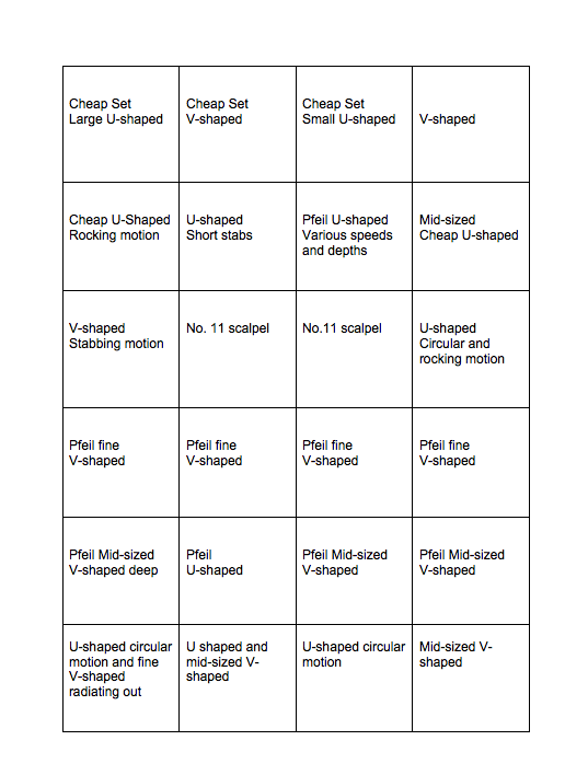
For this project you will need a piece of lino approximately 30cm by 20cm (A4). Begin by marking out a grid on your lino of four squares by six squares. You can draw this directly onto the lino using a soft pencil. These will each be approximately 5cm square.
In each of these squares you will cut a variety of marks using a different cutting blade or approach.

First I assembled a variety of cutting blades, a bench hook and a piece of standard battleship grey lino in A4 size. I had a cheap beginners Lino cutting kit containing three U shaped gouges of various sizes, one straight blade and one V gouge. These weren't great - they weren't particularly sharp but giving them a but of sharpening with the Arkansas stone followed by the slip strop with lots of honing compound helped (although they're still not my favourites.)
On a previous lino printing workshop at Leeds School of Art, I had been introduced to the wonderfully sharp Swiss Pfeil tools with mushroom shaped handles and had treated myself to three of these. I have two V shaped gouges one of which is very tiny (L 11/0.5) for fine detail. I also have a medium sized U shaped gouge. 


Lino cutting tools, Arkansas stone and slip strop for sharpening

I thoroughly enjoyed the process of mark making using a variety of tools and movements including rapidly executed lines, stabbing and twisting motions, circular gouging and rocking the blade from side to side while moving across the lino. I also made linear patterns using a number 11 scalpel blade. 

However, when I came to print the test block, I encountered a problem. No mater how many times I passed the roller across the block with the oil used ink, it just didn't seem to cover it. I was working at Leeds print workshop and tried several times with more ink and increasing pressure on the press (we were using heat transfer printer on which the heating element no longer worked to print the lino) but I just couldn't get a nice clean print. 

The technician at the print workshop came to my aid. He tried inking and printing the block with the same results. Eventually, we came to the conclusion that there was some sort of coating on the surface of the block which was preventing it from taking the ink. I hadn't thought to wipe the Lino before trying to print it. I've since learnt that some people go to the trouble of lightly sanding the Lino to give it a bit of a 'tooth' to accept the ink before they start carving. In my case it was only necessary to wipe it down with a solvent. First I cleaned the block with vegetable oil, then I went on to vigorously rub the surface with some odourless turps substitute. This worked and I was finally able to get a reasonable print after a morning of struggling. 

Print before the plate was cleaned with solvent


Print after cleaning with solvent

One interesting change when the plate took up the ink better, was that the lines I'd made with the scalpel blade, which were clearly visible before, were now almost obliterated by the ink but just gave a grainy texture. This may prove useful in future projects. 

Below is a rough plan of how the marks that appear on the print were made:

There is a lot more that I could do with this project such as using other tools apart from Lino cutting tools (but I'll reserve these for when I do the experimental mark making project). It would also be useful to also try out my tools on the various different typed of block available such as the green Japanese vinyl and soft cut Lino. I intend to do these experiments as I move through the projects, but for now I'm going to move on to the next project. 

Friday, 1 June 2018

Drypoint and Monoprint Workshop at WYPW

Last year, before I stopped work on the course, I attended a drypoint and monoprint  day course at West Yorkshire Print Workshop. The course was taught by Cath Brooke Click Here to link to the artist's website. The teaching was excellent. Attached is text from the course notes. 

It was also very valuable to see other students working in the same medium as we all produced very different work. 


Unfortunately, I was already starting to feel unwell at this time so my choice of subject matter wasn't particularly inspired. Nevertheless it was a useful day to practise with the technique. 


Drypoint plate


I particularly enjoyed the fact that the image could be changed considerably depending on how the plate was wiped. I am especially drawn to the very dark effect obtained by selective wiping. On the image below I didn't wipe a lot but I picked out the flowers using a cotton bud. On the second one I wiped more ink away so the lines made by the drypoint tool are more distinct. The third image was printed in two layers one layer with monoprint and another with drypoint. Unfortunately, the plates weren't exactly the same size, but it was a useful experiment.


Drypoint with selective wiping


Drypoint wiped more completely

Two layer print: Drypoint and Monoprint


A New Start

I have been out of action on the OCA course for a very long time. I had completed much of the work for assignment 2 before I stopped work but had not written it up. 

I am very grateful for the help of the Learner support team at OCA. In particular, I'd like to thank Lia who has been corresponding with me via email over recent weeks. 

My original date for completing the course would have been 10th August. However, I am very much relieved to have been grated an extension due to mitigating circumstances to allow me to have sufficient time to complete printmaking 1. I fully intend to take advantage of this extension to complete the course to the best of my ability. 

Some of the posts that follow relate to work which I had done before I stopped work. I can't remember the exact dates on which I completed everything so I won't backdate the posts.